
TIMELINE
6 weeks
TOOLS
Illustrator
Indesign
Miro
ROLES
Narrative Development
Typography
Color Palette
Gradient system
Brand Identity System
Brand Guidelines Book
Typography
Color Palette
Gradient system
Brand Identity System
Brand Guidelines Book
TEAM
Kyra Anderson
Odin Amador
Chris Kaku
Robert Wozniak
Elise Stuckenberg
OVERVIEW
To celebrate the work of its graduating class, Seattle Central Creative Academy holds a portfolio show, better known as Portshowlio. For the class of 2020 circumstances completely virtual experience. Being on the branding team, we were tasked with not only creating a brand identity for the show but crafting a strong narrative to build a virtual show around that felt relevant to and engaging our audience, potential employers and to us as creatives. Because of the virtual nature of our collaboration, it was more important than ever to craft a strong brand guidebook and libraries of assets that could be used by all the teams.
THE PROBLEM
The graduating class of 2020 was faced with the unique position of crafting a portfolio show in the midst of a pandemic. With a physical show being no longer a possibility, we were faced with a challenge – and opportunity – to showcase the class of 2020 in a way that has never been done before.
OBJECTIVE
Create a show that our audience will want to actively engage with, showcase our work and skill sets and ultimately get us seen (and hired!) by potential employers. Branding plays two main roles in this process: First, We needed to create a strong visual direction, that would draw in potential employers and other creatives and get them to our page. Then we have to keep them engaged. This is where the narrative comes into play. We have to create a strong enough narrative that gave them a reason to engage and actively participate. It was our role to create brand guidelines and assets for use, and craft thoughtful copy that ultimately told the engaging story of our experience.
AUDIENCE
For over 10 years, Seattle Central Creative Academy has organized a celebratory portfolio show for each graduating class. It attracts industry professionals, alumni, friends, family, and anyone with a foot in the creative world. Portshowlio is about connecting us as creatives to the prospective industries we will find our careers in, and celebrate our accomplishments and growth over the past two years. With this in mind, we’ve built a brand and narrative that accommodates the way our audience will perceive our show by providing a concise, engaging story.
OUR MISSION
Separated by circumstance but connected by our creativity, we come together united by a common mission: showcasing the Class of 2020. You are invited to take a tour of our galaxy and discover what makes us individual and well rounded as creatives.
BRAND EXPLORATION
When we reapproached the branding process at the start of our new virtual spring quarter, we needed to re-think both our narrative and our visuals, so we went back to the drawing board, staying somewhat in alignment with what we had originally decided our theme would be, but altering it to make a little more sense in our current circumstances. With some collective brainstorming, we shifted our narrative into a space that felt a little more in alignment with what we were experiencing.
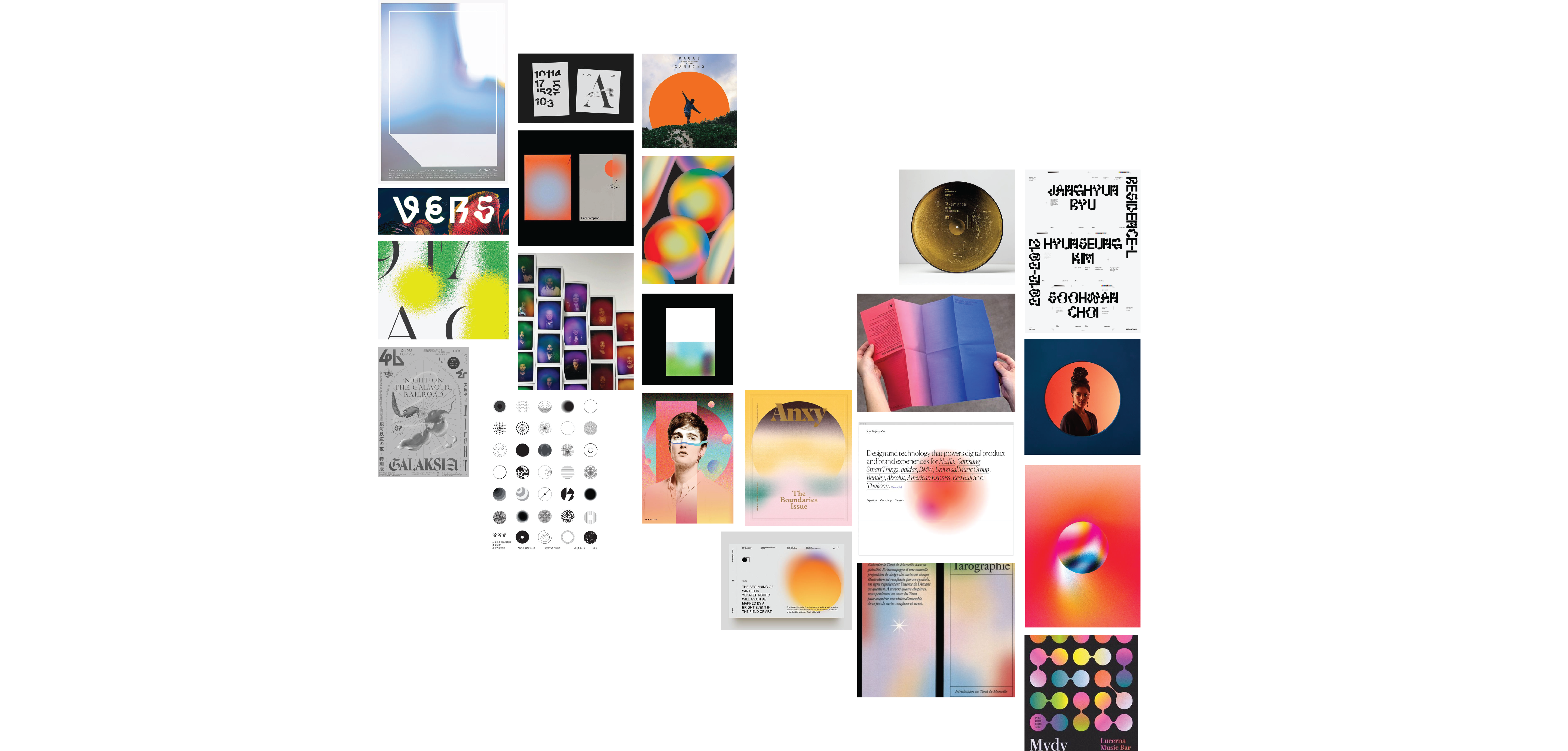
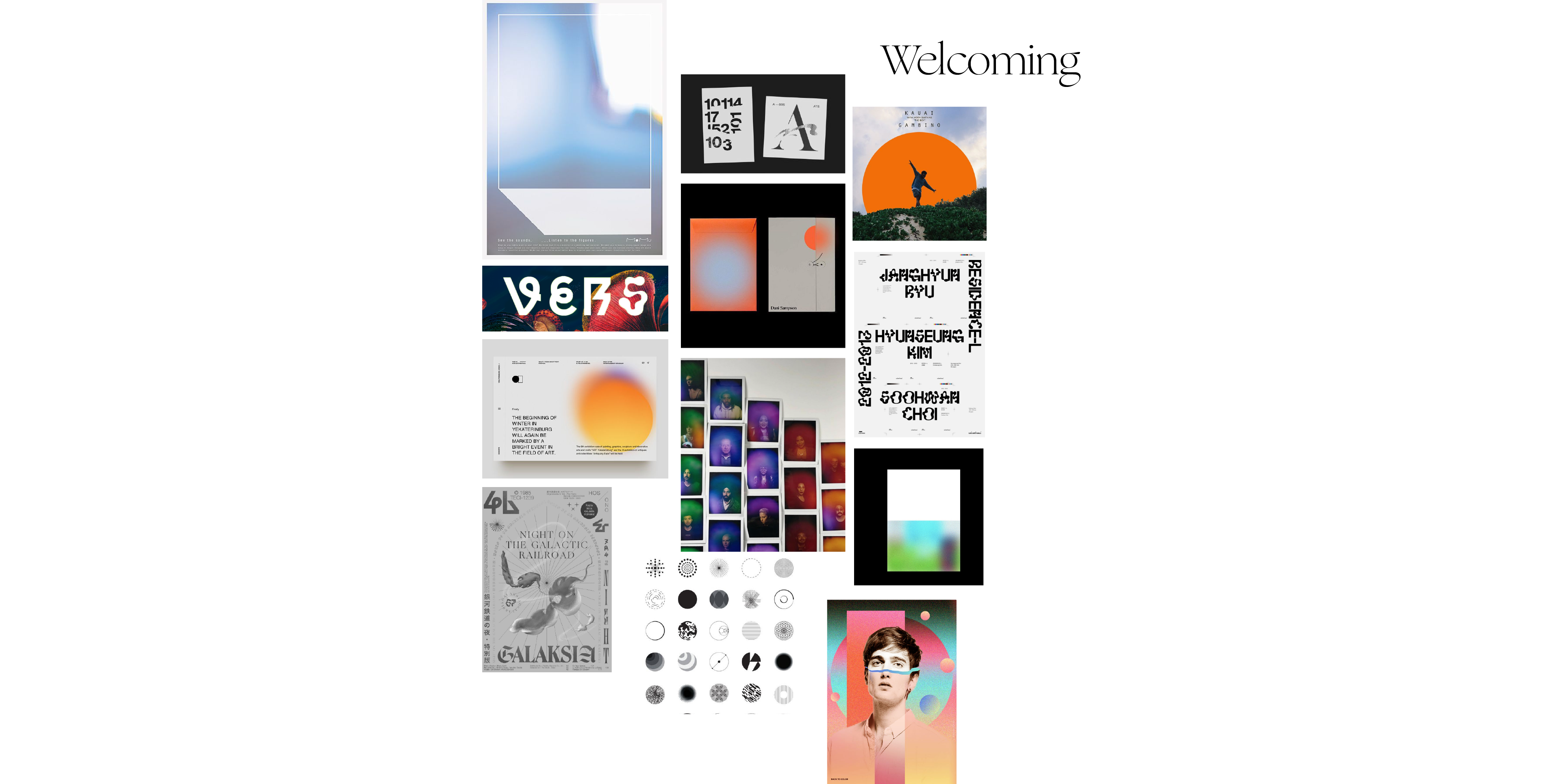


From there we revisited our visuals to try to establish what we are and what we are not, based on this new idea of our theme. While we kept some elements from our initial visual exploration session, we found that we needed to shift direction slightly to move away from the idea of extraterrestrial. We found that we still gravitated towards the use of gradients, but that we were also inspired by 70s sci-fi novel covers and the interesting graphics that incorporated the use of minimalism and grid for a retro-futuristic feel. We collectively developed the following concept board based off of the tonal territories of experimental and welcoming.
WELCOMING
The visual design is engaging, not alienating. Soft, eye-catching gradients in three-dimensional, geometric shapes represent mysterious worlds ready to be explored. The journey promises to be pleasant, marked by simple shapes and hazy texture.
.
EXPERIMENTAL
We believe in bold experimentation. We join ideas and elements in new combinations because it leads to exciting discoveries. The Class of 2020 has conceived a universe of interactivity and play, drawing visitors in and inviting them to encounter each creative’s portfolio.
DESIGN SYSTEM
We wanted to avoid being too literal or direct with our visual and verbal tone and wanted to steer clear away from anything that felt too cliché or spacey in the traditional sense. After establishing what direction we wanted to go visually we broke into smaller teams and dove right into an exploration of assets, including how to make gradients that had the look and feel that we were going for, typographic and color choices, and brainstorming of a glyph set. I was on the typography team, the color palette and gradient team, and the team that would ultimately create the brand guide book that detailed proper usage of all brand assets for a team of almost 50.


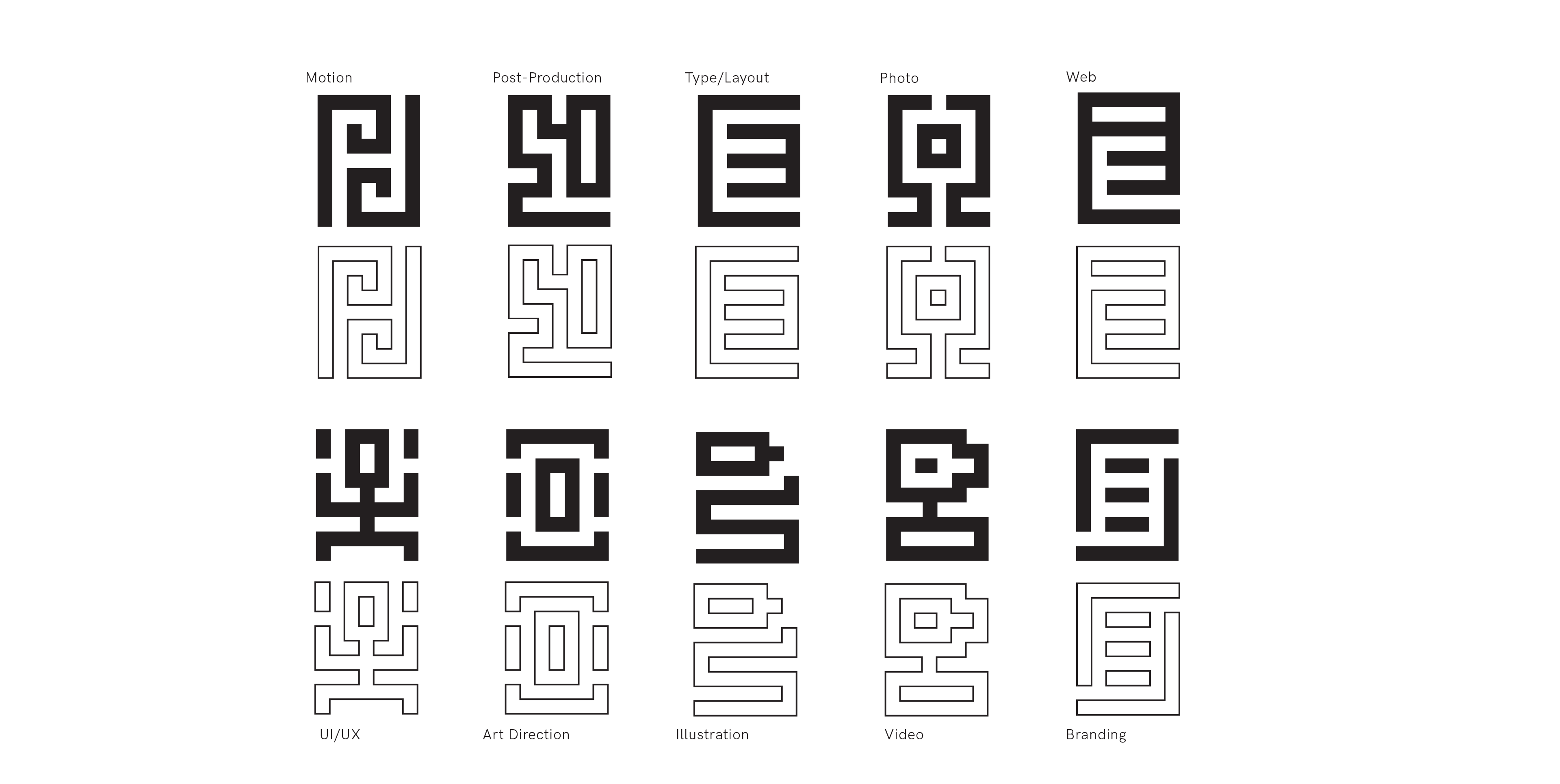
We developed a design system
that consisted of typographic
choices, color palette, gradients,
brandmark, glyphs and grids.
Elise, Min, Siri and I where responsible for choosing the typeface direction for our display and body copy. We chose Ogg is our display typeface, as expressive and bold as the living gradients at our brand’s core. HK Grotesk is our all-purpose typeface; titles, body copy, captions, you name it. A descendant of the classic grotesques, it has been updated over time to support a broad spectrum of applications, from environmental signage to mobile. As an open source typeface generously offered for free by Hanken Design Co., it aligns with SCCA’s core values of inclusion and collaboration.I then went on to work with Robert and Odin to develop a type variable scale.
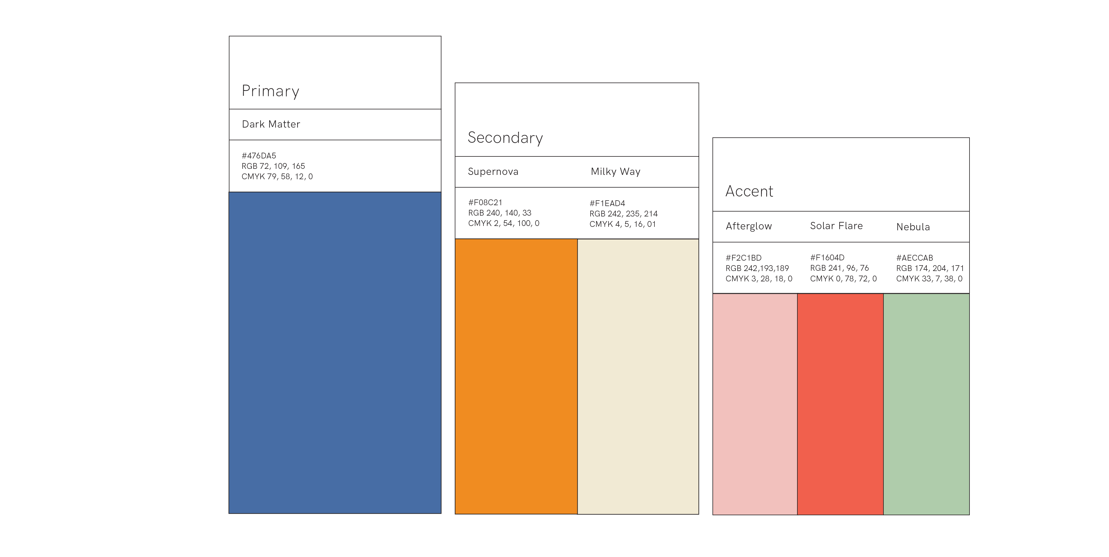
Kyra, Robert and I pulled together preliminary color palettes and vetted them. We ended up landing on out of my palettes which consists of one primary color, two secondary colors and three accent colors. The palette was built with application in mind and for optimal blending results when creating gradients. The spacey blend of soft and bold tones will that pair well with colors across the broad spectrum our projects.
Kyra, Robert and I pulled together preliminary color palettes and vetted them. We ended up landing on out of my palettes which consists of one primary color, two secondary colors and three accent colors. The palette was built with application in mind and for optimal blending results when creating gradients. The spacey blend of soft and bold tones will that pair well with colors across the broad spectrum our projects.

I also led the gradient team. After finding an approach that was producing results we liked, I created a tutorial for the rest of the team to follow. Between the five of us, over the course of a week we were able to create 120 assets for use on web, print and social. We also created a methodology to layering gradients, which blend modes to use and recommendations for creating compositions. Below are examples of gradient use in context to layout.


BRAND GUIDE
Odin and I took on creating the brand guide layout and structure. Together we established what the hierarchy would be and how we would display content and rules. Since this was to be used by a large number of people we didn’t want much variation in the structure of the layout so it was easy to navigate and find information. All together the Brand Guidelines is 50 pages long with usage rules on type, color, gradients, glyphs and grids. After we established what our layout and hierarchy would be, my specific role was to layout the content on each page, while Odin took on copywriting. Kyra also helped generate content for specific sections such as wordmark and glyphs and did copywriting for those sections.
READING
The Overstory
©2025 Brit Van Guilder
©2025 Brit Van Guilder
