TIMELINE
12 weeks
TOOLS
Illustrator
InDesign
After Effects
Procreate
Photoshop
ROLES
Brand Identity
Layout
Content Strategy
Animation
Layout
Content Strategy
Animation
TEAM
Kyra Anderson
OVERVIEW
The Belltown business, Spa Noir, hoped to develop a visual identity that was consistent with their company ideals, that represents their personality and connects them to their target demographic. We were tasked with building out a series of components that could be used across a multitude of platforms and a set of brand guidelines and standards, outlined in the brand guide book. Ultimately this project included the creation of all print collateral, a brand identity suite, a social media campaign, outdoor signage, and the compilation of all these components in a brand guide book.
RESEARCH
“What makes me the
most proud is that in
Spa Noir, a space has
been created to give
every person who walks
through the door a place
of relaxation, acceptance,
encouragement,
and self love.”
Spa Noir is a day spa located in bustling Belltown, not far from the city’s downtown core. The spa is owned by Seattle native Jessica Norton and it has been a loved part of the community for 16 years. The company employs estheticians, massage therapists and nail technicians. This woman owned business has a long history of being socially inclined, giving back to the community through donating portions of their proceeds to issues of social justice. They are invested in the community of Belltown, often voicing their support of the other small businesses in their area. Customers repeatedly express their satisfaction with the fact that the products Spa Noir use and sell are locally sourced or from Eminence, an organic Hungarian skincare line, showing ethical and environmental responsibility. They’re known for being the go to Spa for skin treatments if you have sensitive skin or those looking to avoid harsh chemicals during skin treatment.
In terms of atmosphere, Spa Noir would describe themselves as eclectic and historic. The Spa staff members are continuously described by customers and inviting and warm, creating a sense of community and care for their customers. The owner once stated “I think what makes me the most proud is that in Spa Noir, a space has been created to give every person who walks through the door a place of relaxation, acceptance, encouragement, and self love.”. There is an authenticity that comes through in their business practices, in the care for the community they are invested in and in the products and services they offer. They express pride in using high quality products, and put an emphasis on being natural and clean. They are known for being socially inclined, not only giving a portion of sales back to the community but also by hosting classes and events to engage with the community.
In terms of atmosphere, Spa Noir would describe themselves as eclectic and historic. The Spa staff members are continuously described by customers and inviting and warm, creating a sense of community and care for their customers. The owner once stated “I think what makes me the most proud is that in Spa Noir, a space has been created to give every person who walks through the door a place of relaxation, acceptance, encouragement, and self love.”. There is an authenticity that comes through in their business practices, in the care for the community they are invested in and in the products and services they offer. They express pride in using high quality products, and put an emphasis on being natural and clean. They are known for being socially inclined, not only giving a portion of sales back to the community but also by hosting classes and events to engage with the community.
AUDIENCE
Being a small business located downtown, their primary audience are Seattle dwellers. However there is a fair amount of nearby hotels so they also see a significant amount of client base coming from non-locals. Looking further into that demographic they tend to cater towards a health and wellness conscious demographic and to an alternative scene, with CBD and natural/organic products.
OUR MISSION
Warm, artisan and alternative. Spa Noir offers health and beauty treatments that consider the well being of the customer, community and environment. Through authenticity and focusing on the integrity of our products, we create an environment of relaxation, acceptance, encouragement, and self love.
BRAND POSITIONING
Spa Noir is the ideal urban retreat that specializes in spa and beauty treatments for sensitive skin. Our brand integrates care for the mind, body and spirit. We believe in making people healthy, which is why we have certified and knowledgable staff that provide a personalized experience for our guests.
BRAND EXPLORATION
The branding process started with a brand visual exploration exercise, collecting a wide range of images and determining whether or not they resonate with our brand or not. We found that we were drawn to imagery that
We found that we were drawn to imagery with industrial touches organic lines/textures, curved geometry, and breathing room. We also felt elements from plants and nature, raw materials, and a warm palette with accents of cool shades was on brand. After deciding which images did and did not resonate with us, we put words to why. We broke down what exactly was making it feel on/off brand in order to create a descriptive vocabulary and sorted and grouped those words until we reached three over arching brand characteristics: Warm, Artisan and Alternative.
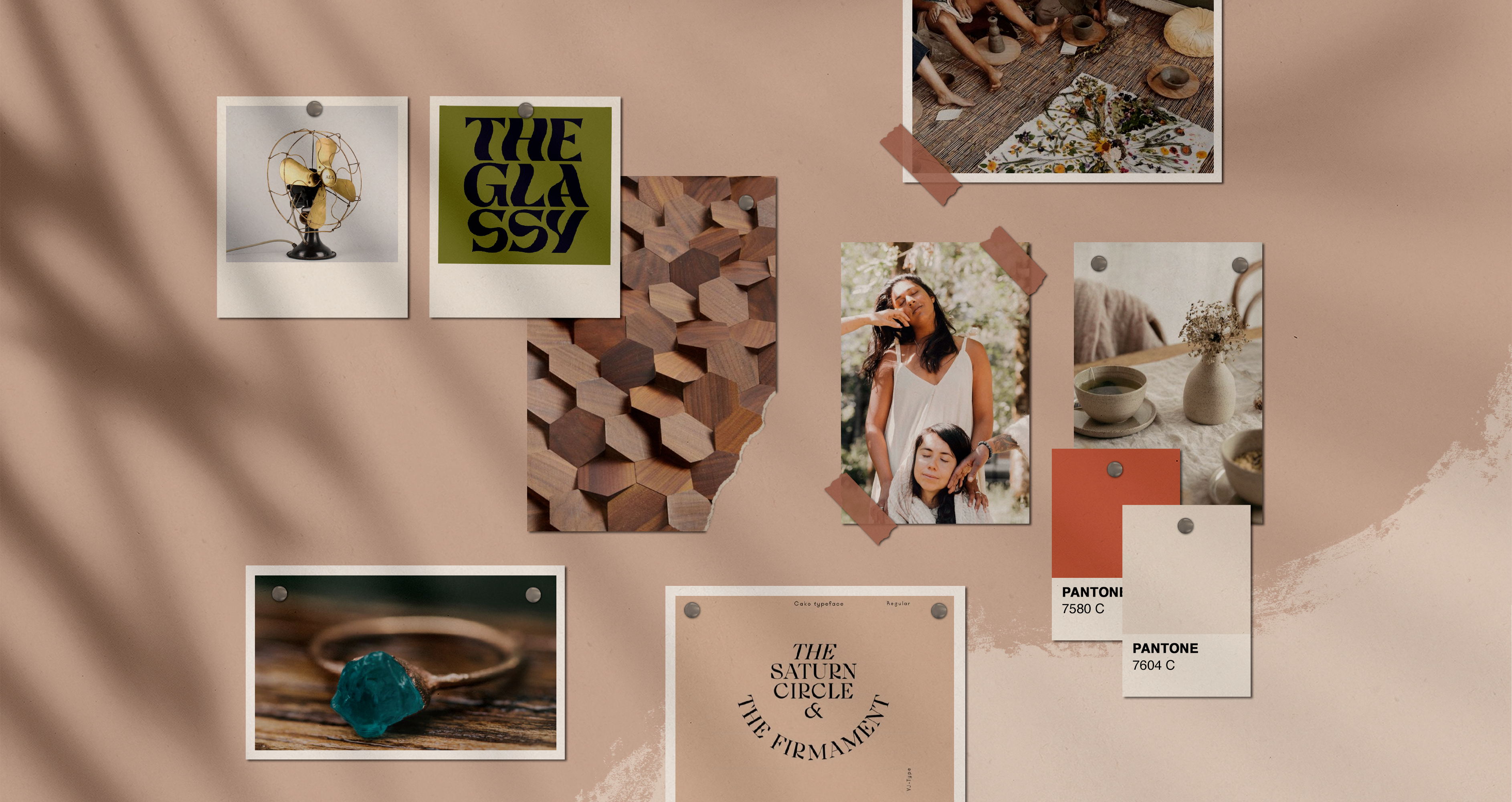
Our final concept board consists of industrial touches organic, lines & textures, and curved geometry. We found that breathing room & negative space makes aides in a warm, inviting layout. The artisan quality of raw materials and warm, neutral palette helps communicate Spa Noir is geared toward use of more natural products. Altered serifed typography communicates the refined alternative quality of Spa Noir.
WARM
Spa Noir by nature has a warm inviting atmosphere. From the energy and interior space, to the hospitality of the staff, guest continuouly report feelings comfortable and invited.
ARTISAN
The products that Spa Noir uses on guests and sells in store have a handmade quality to them with an emphasis on ingredients that are safe for sensitive skin enviromentally responsibe and locally sourced.
ALTERNATIVE
Spa Noirs neo-spiritual mind, body and spirit approach to body work and healing. They put an emphasis on enriching community, promoting products by local vendors and giving back proceeds to organizations.
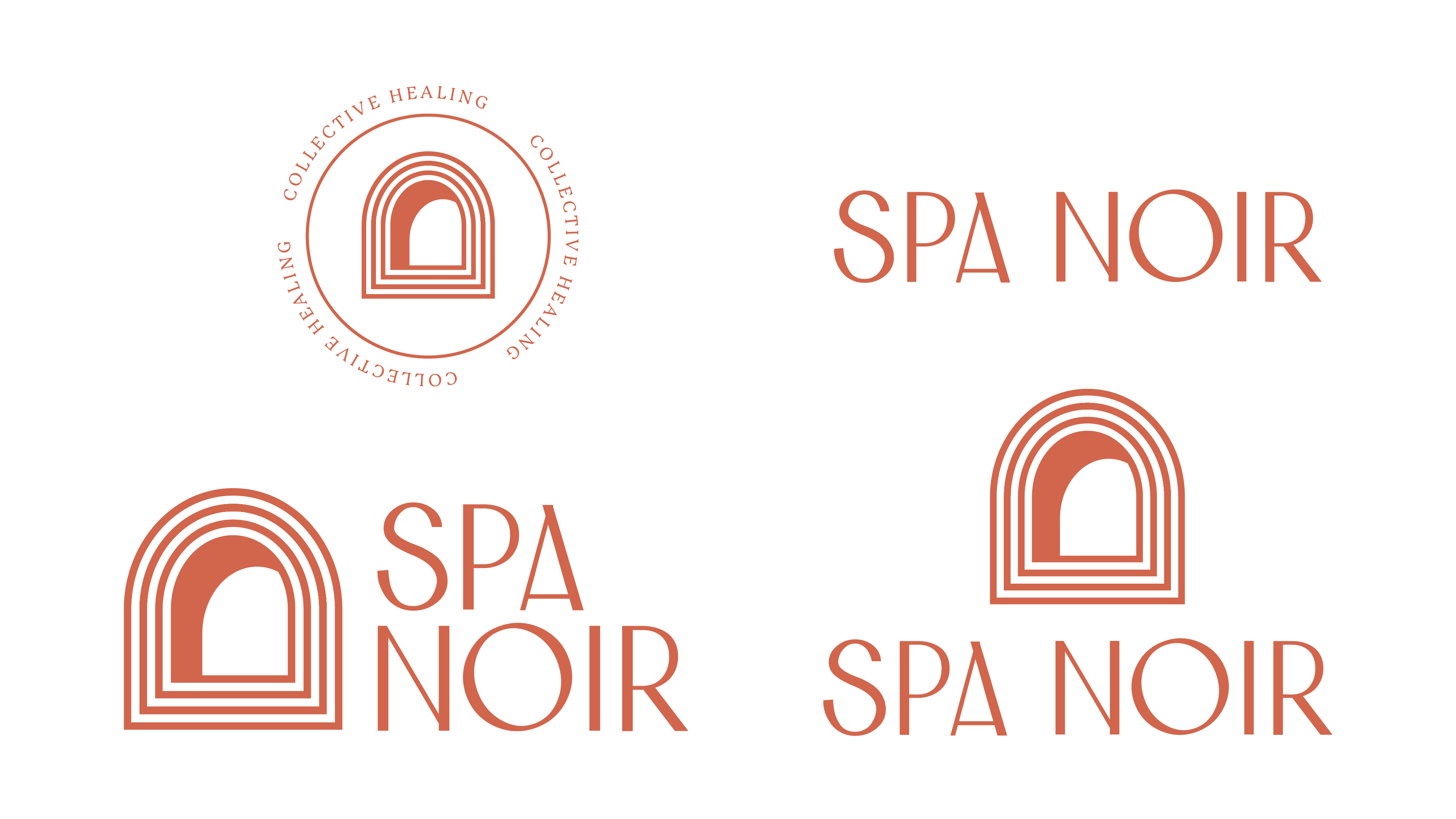
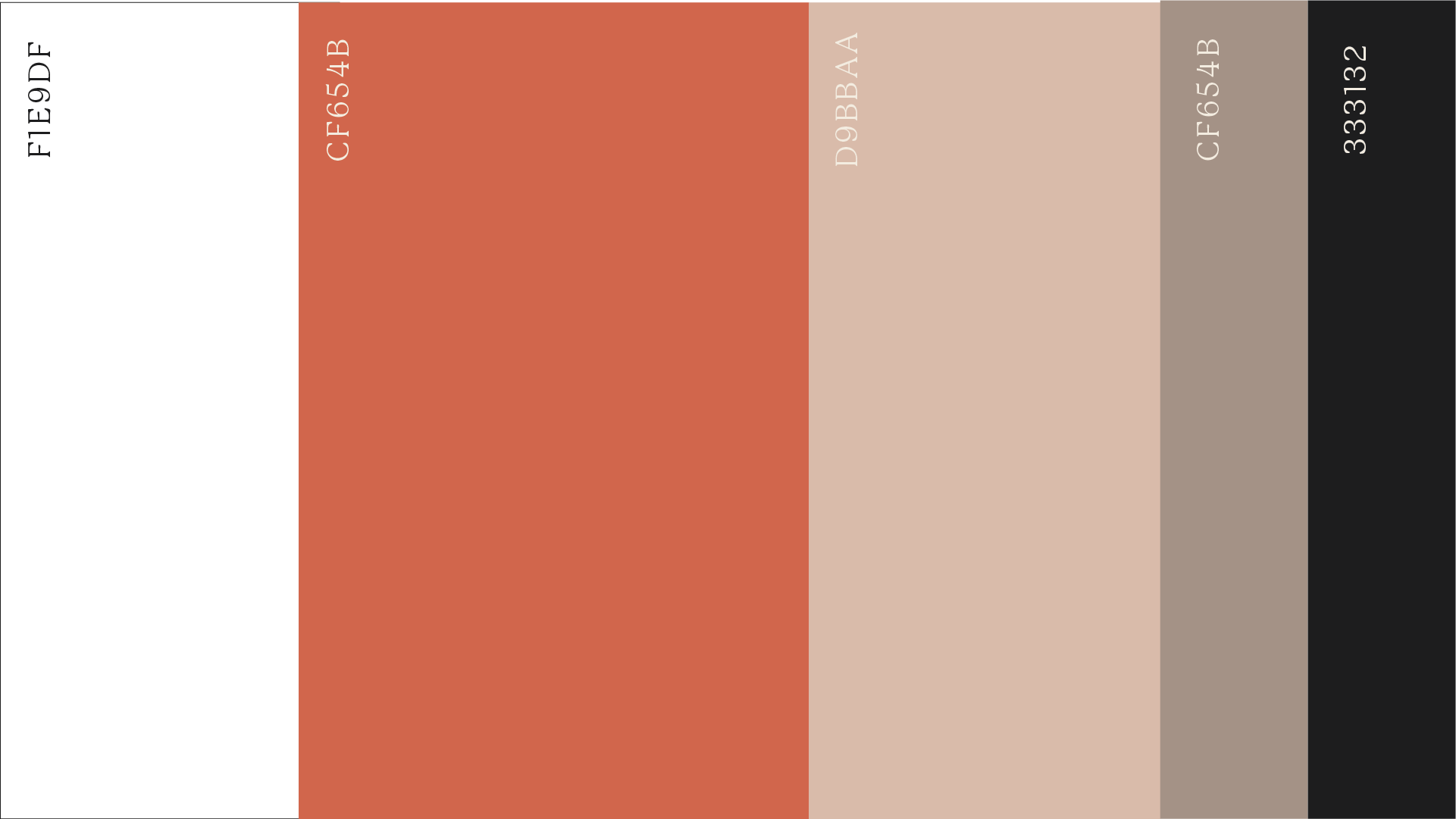
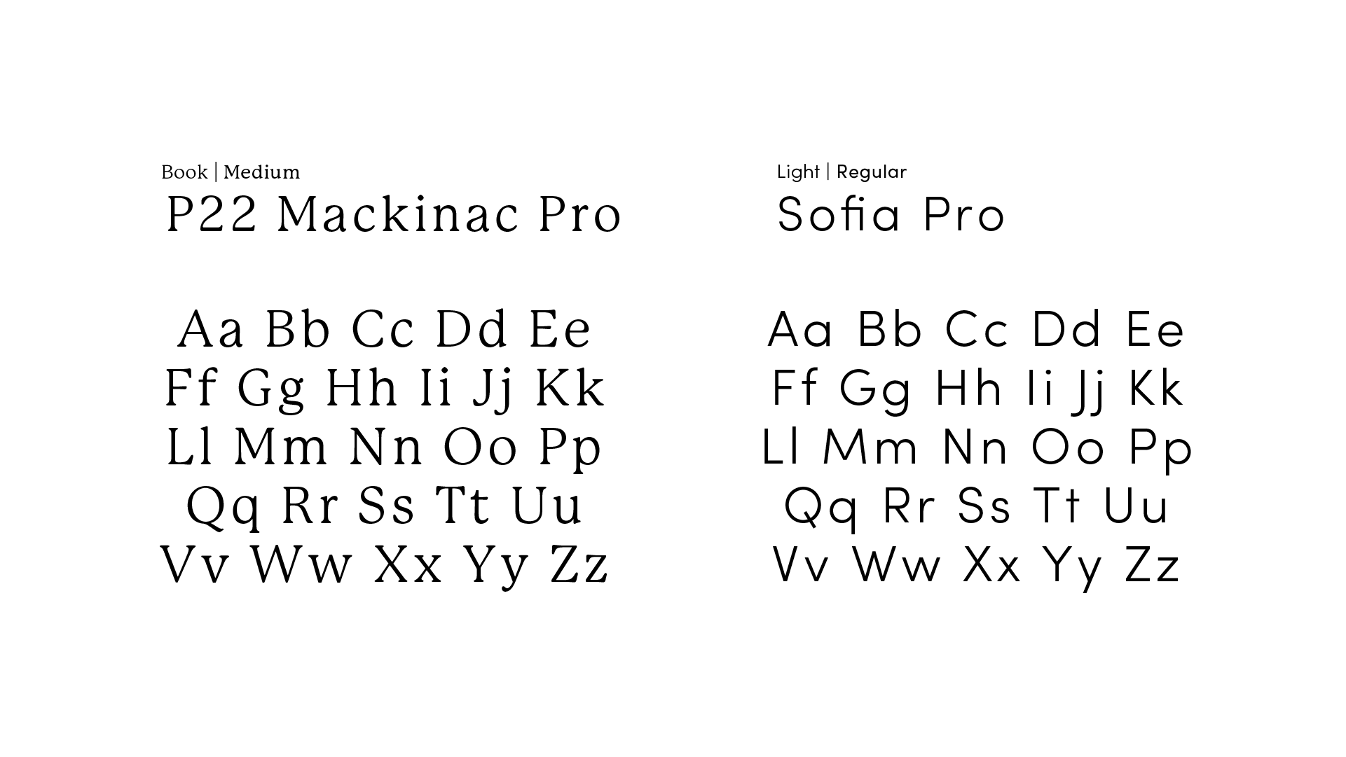
DESIGN SYSTEM
“Below are our final logo
and wordmark, logo variations,
typography chioces, color
palette & textures.”
Our concept board gave us a solid starting point for moving into the design process. We took Into consideration our descriptor words and thought about how we might visually convey these concepts. We started with building out a color palette that felt warm, natural and inviting and exploring typographic choices that were sturdy and dependability but also had the unexpected alternative flair.
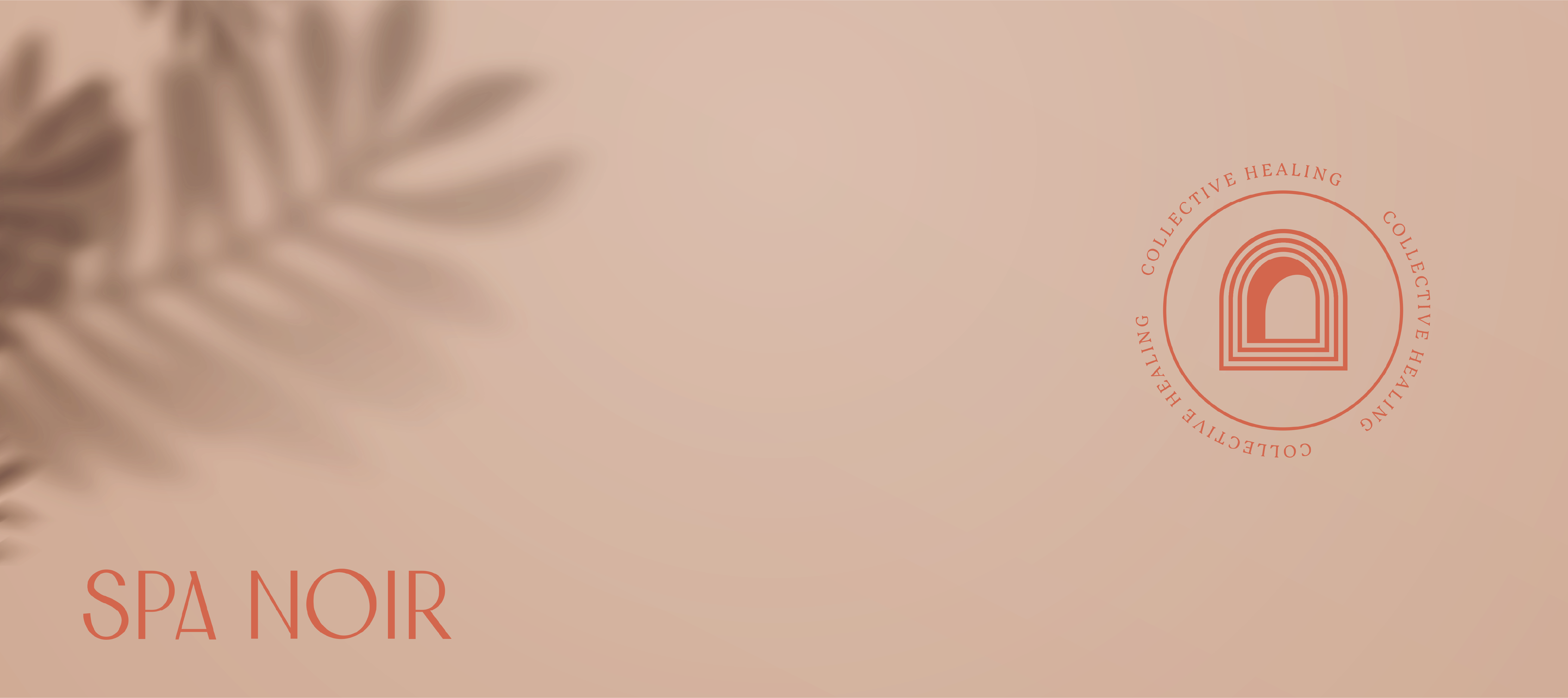
We went through multiple rounds of logo and word mark iterations. We ultimately chose an iteration of one of Kyra’s Illustrations and refined it. We felt this logo choice was representative of both the collective community that Spa Noir fosters and has a way of communicating the warm and inviting atmosphere, with the doorway subtly saying “come inside.” This wordmark is version 2 that Kyra developed. Together, we developed a typography direction, logo and wordmark lockups and color palette. Below you can browse these design assets.

CONTENT STRATEGY
“We focused our efforts on
creating a few strong
pieces of design collateral
that could be used across
a multitude of platforms.”
Spa Noir is a relatively small business so thinking realistically about the content they might want to invest in and what their design needs might be, we found that they likely would be trying to increase their customer base in the greater Seattle area. We focused our efforts on creating a few strong pieces of design collateral that could be used across a multitude of platforms that would generate more business and exposure in their immediate community and build brand message recognition. As seen above, we focused on a wordmark, logo, tagline and secondary elements such as textures to be intgrated. A targeted marketing campaign including printed mailers, social content strategy, and electronic flyers would be the most realistic deliverables we could provide for a business of this caliber.


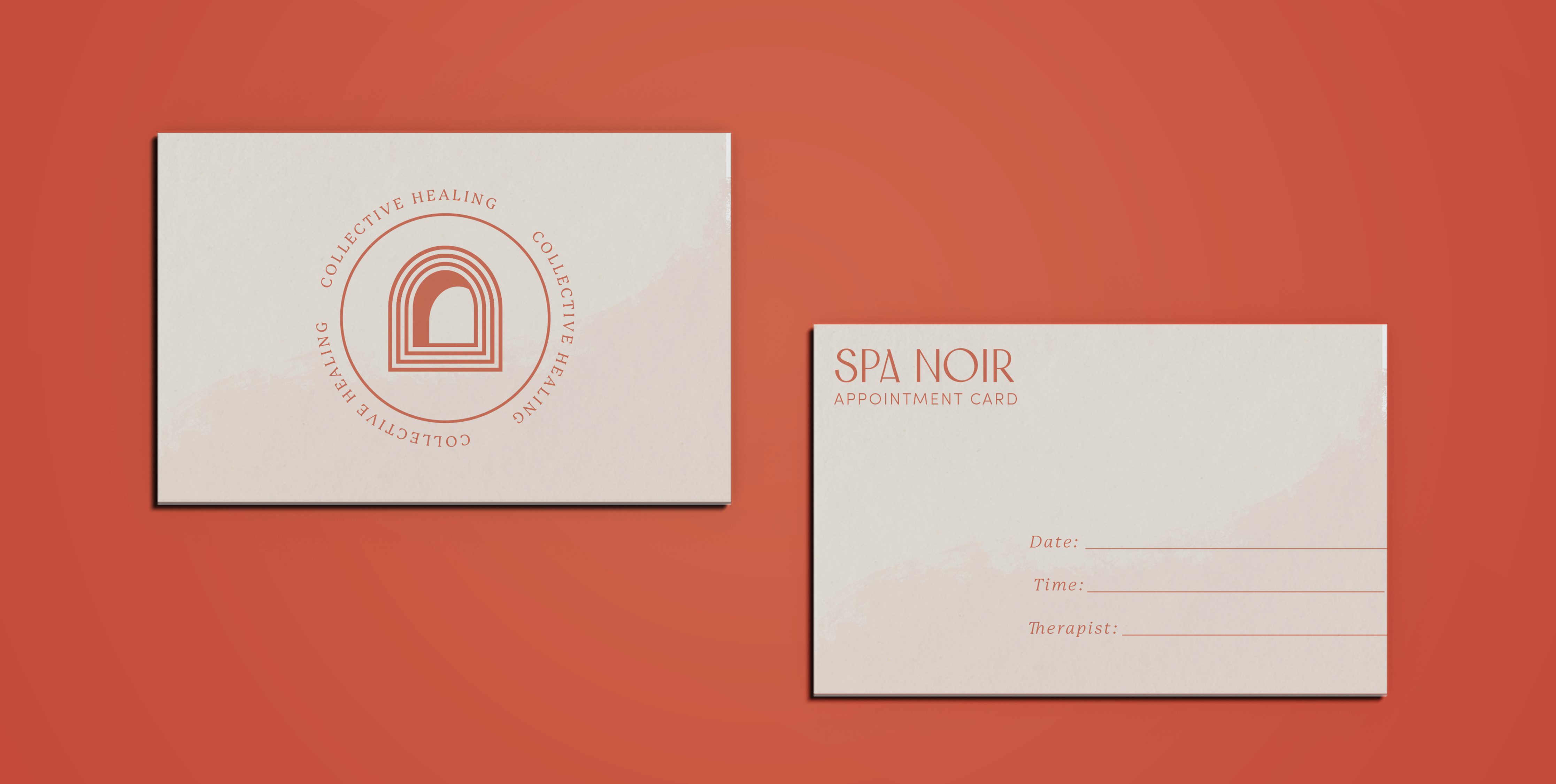
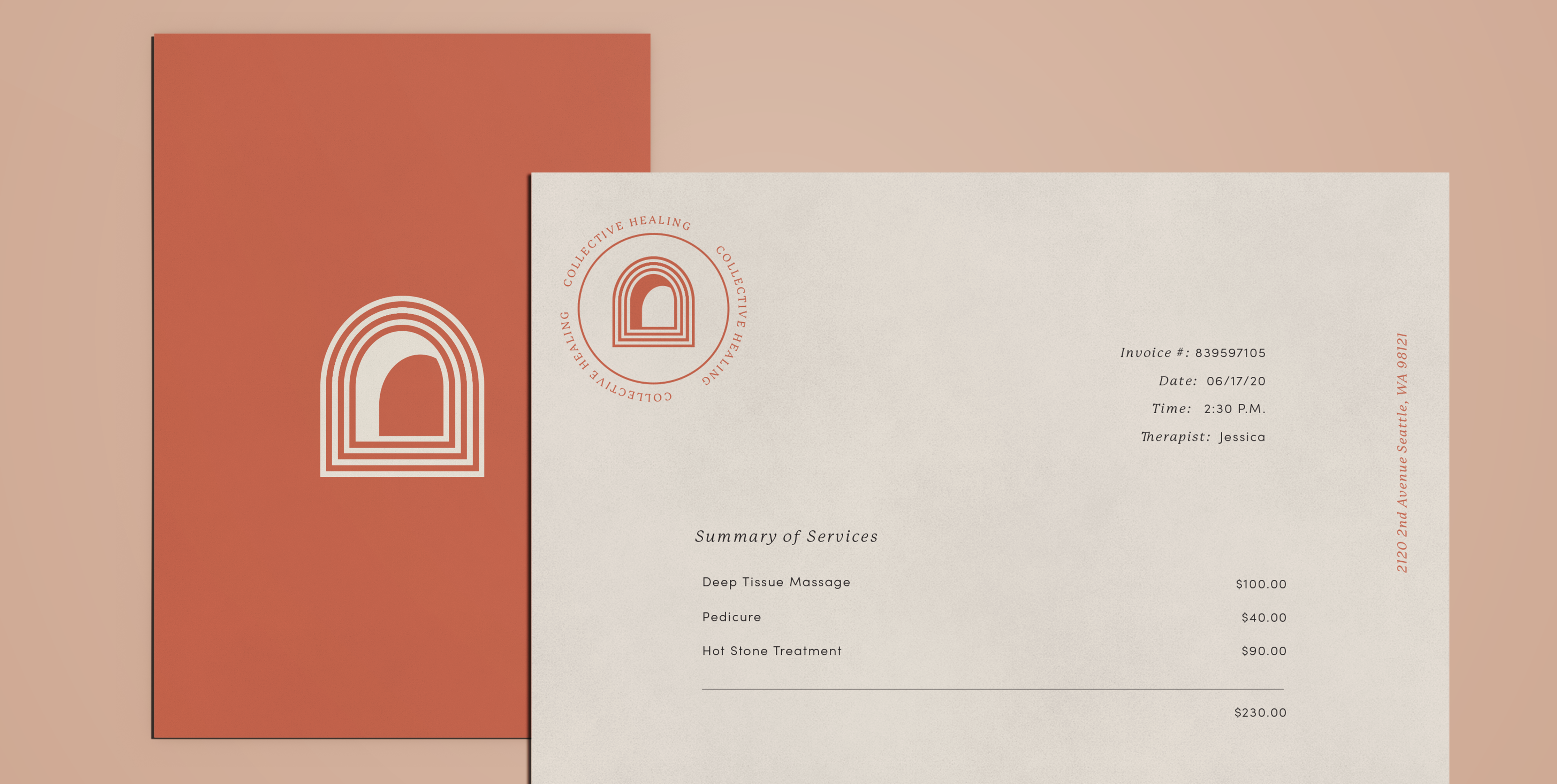
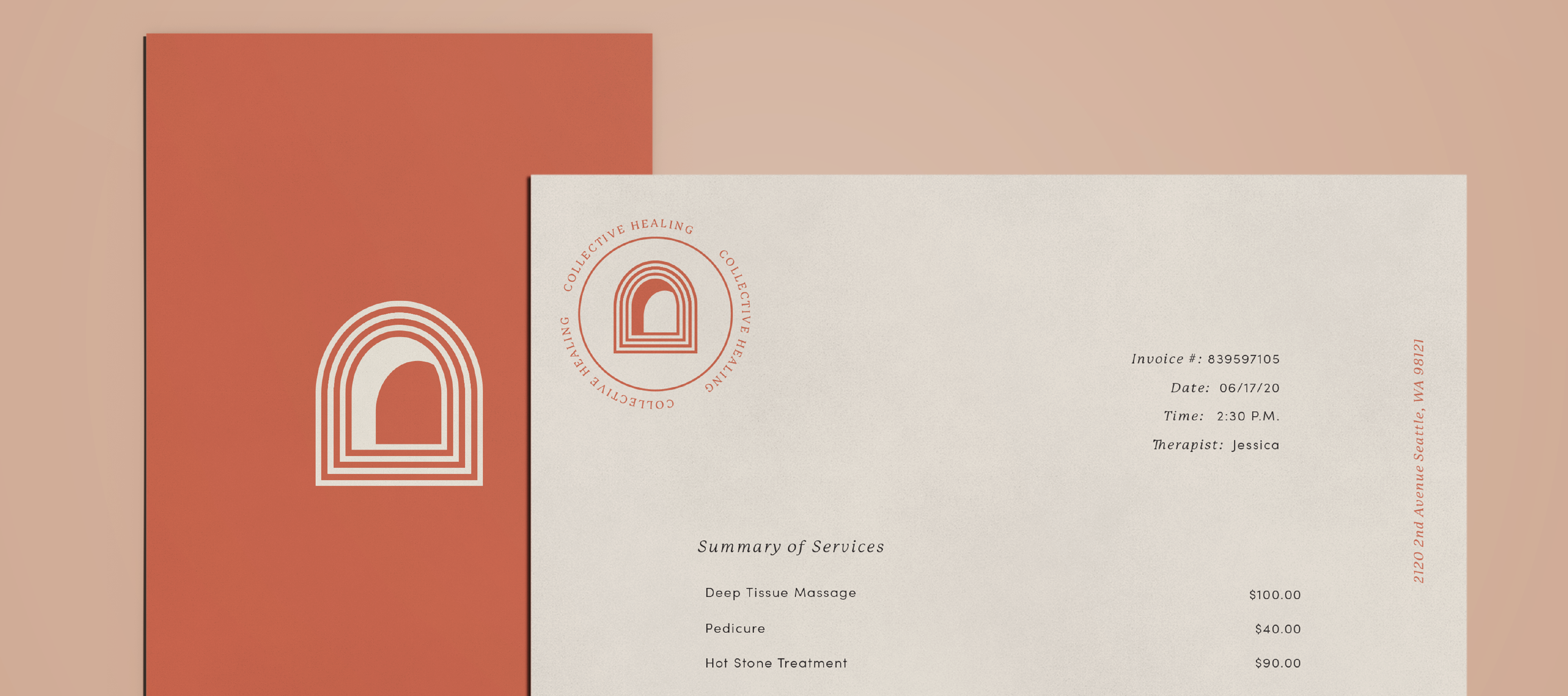
For stationary, the most useful peices would be a business card, appointment card and letterhead. I approached these layouts taking care to leave breathing room, integrate textures to bring forth an artisan feel. Simple, yet elegant typographical choices and color application impact the overall warm, inviting feeling.
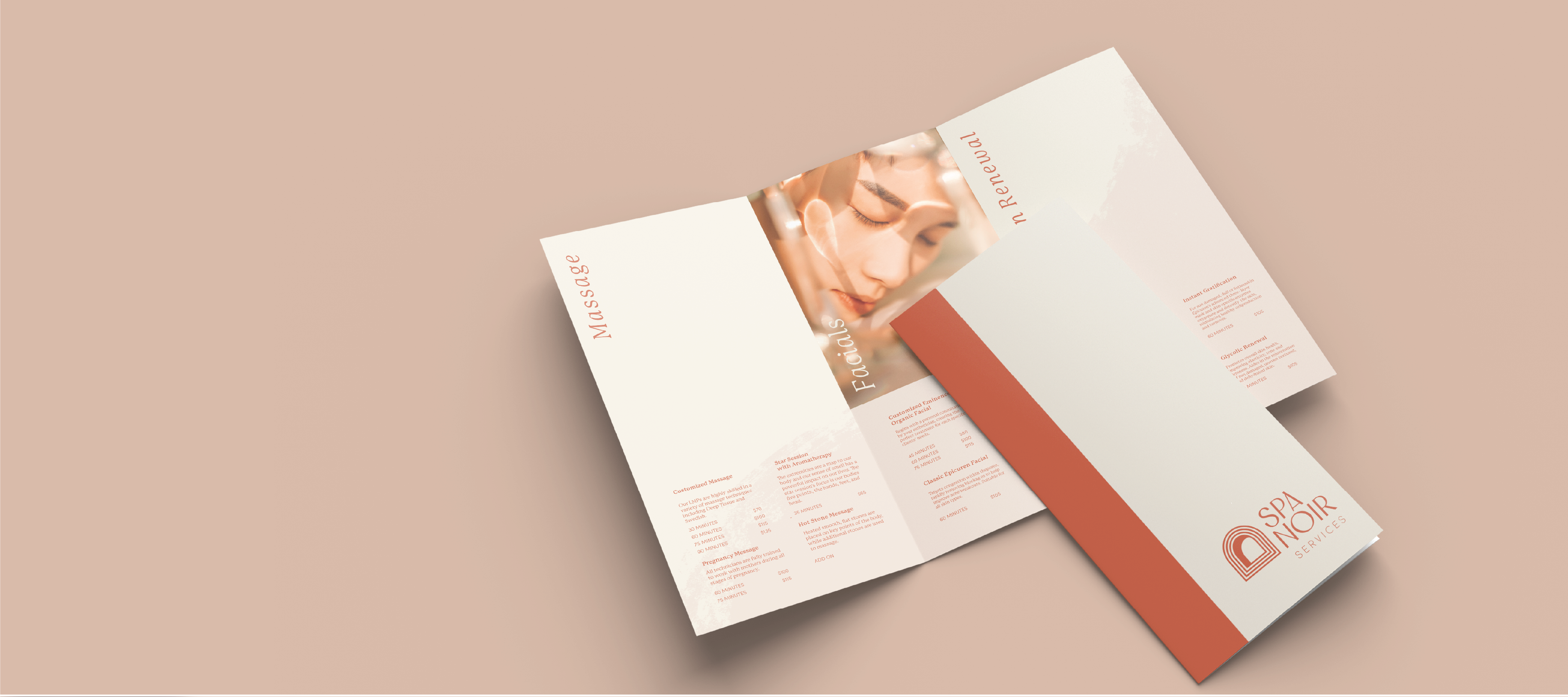
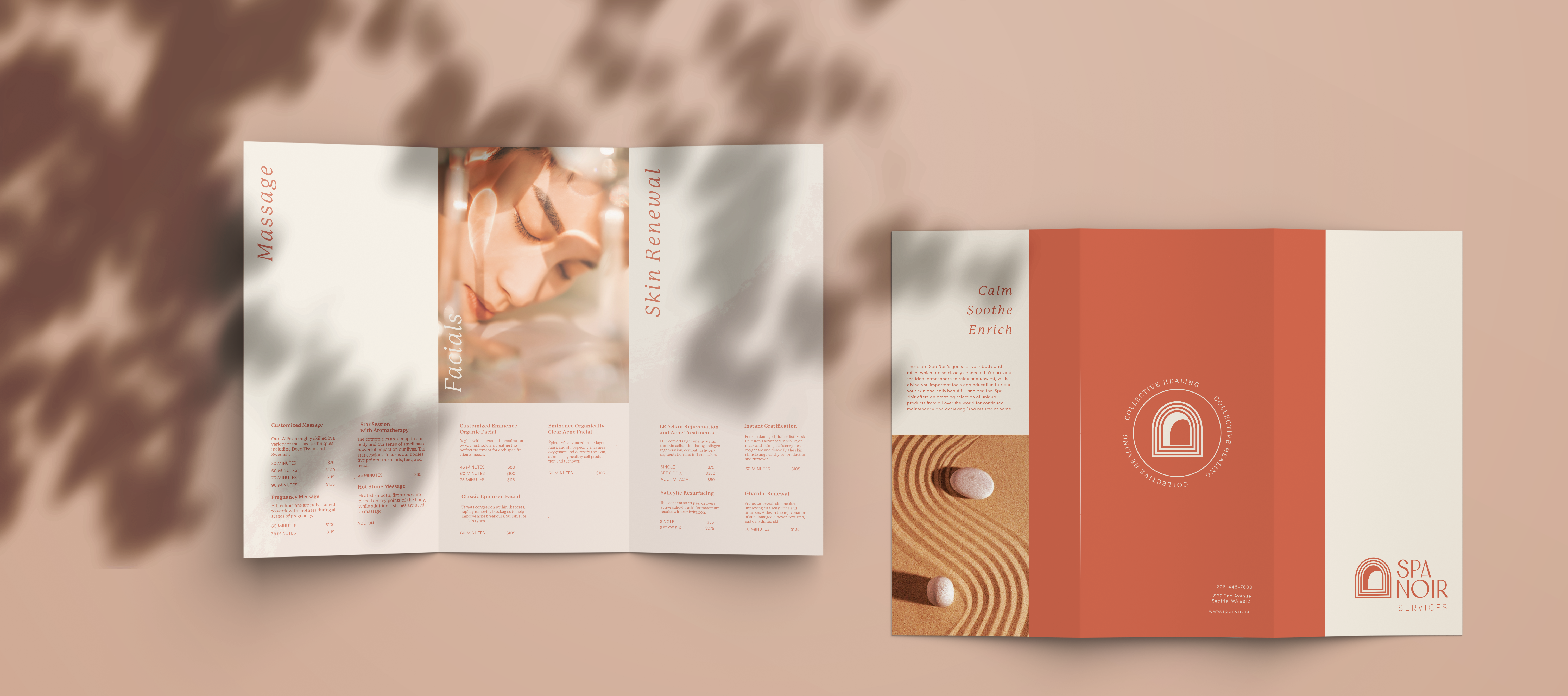
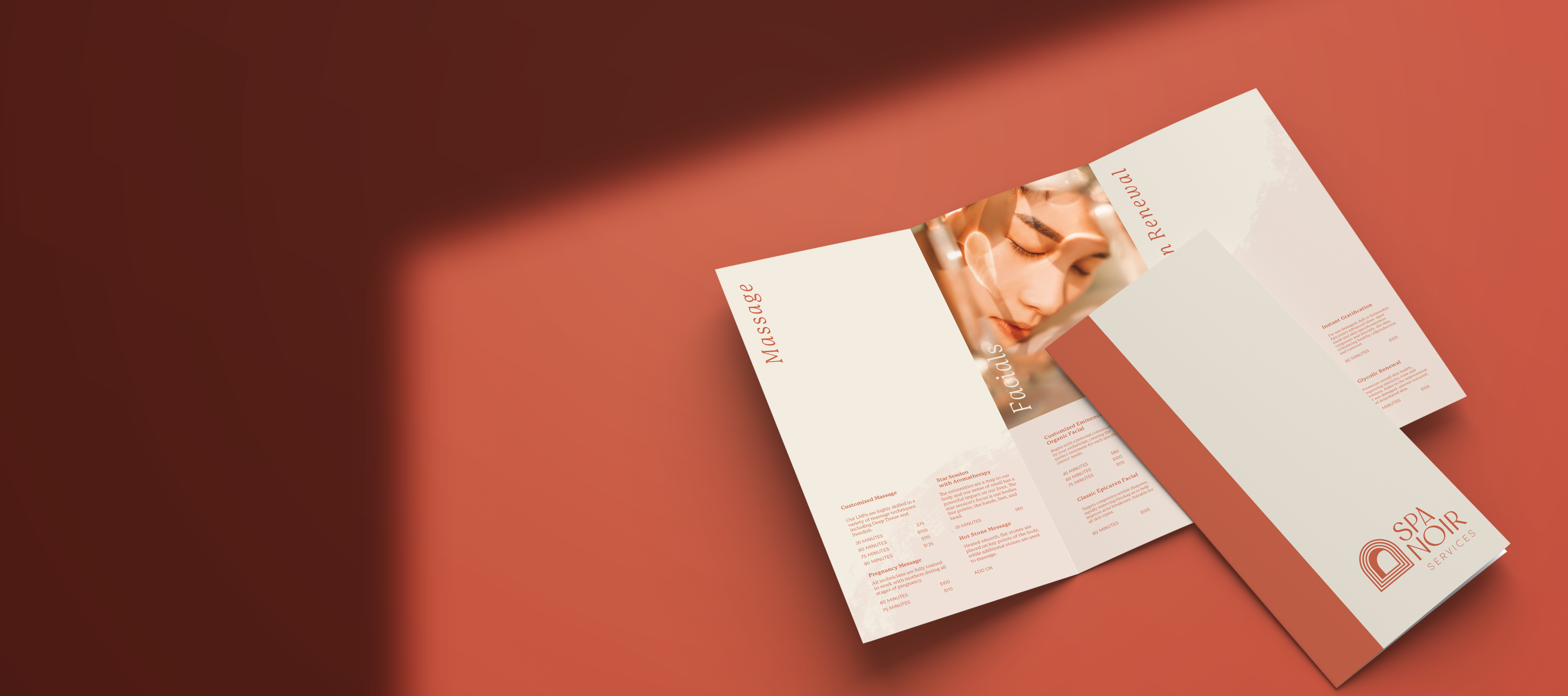
One of the key pieces of collatoral was the trifold menu. This is version 2 that I iterated off of from Kyra’s Initial design. I built the exterior of the phamplet from scratch and took the interior body copy and intergrated it into a new layout.
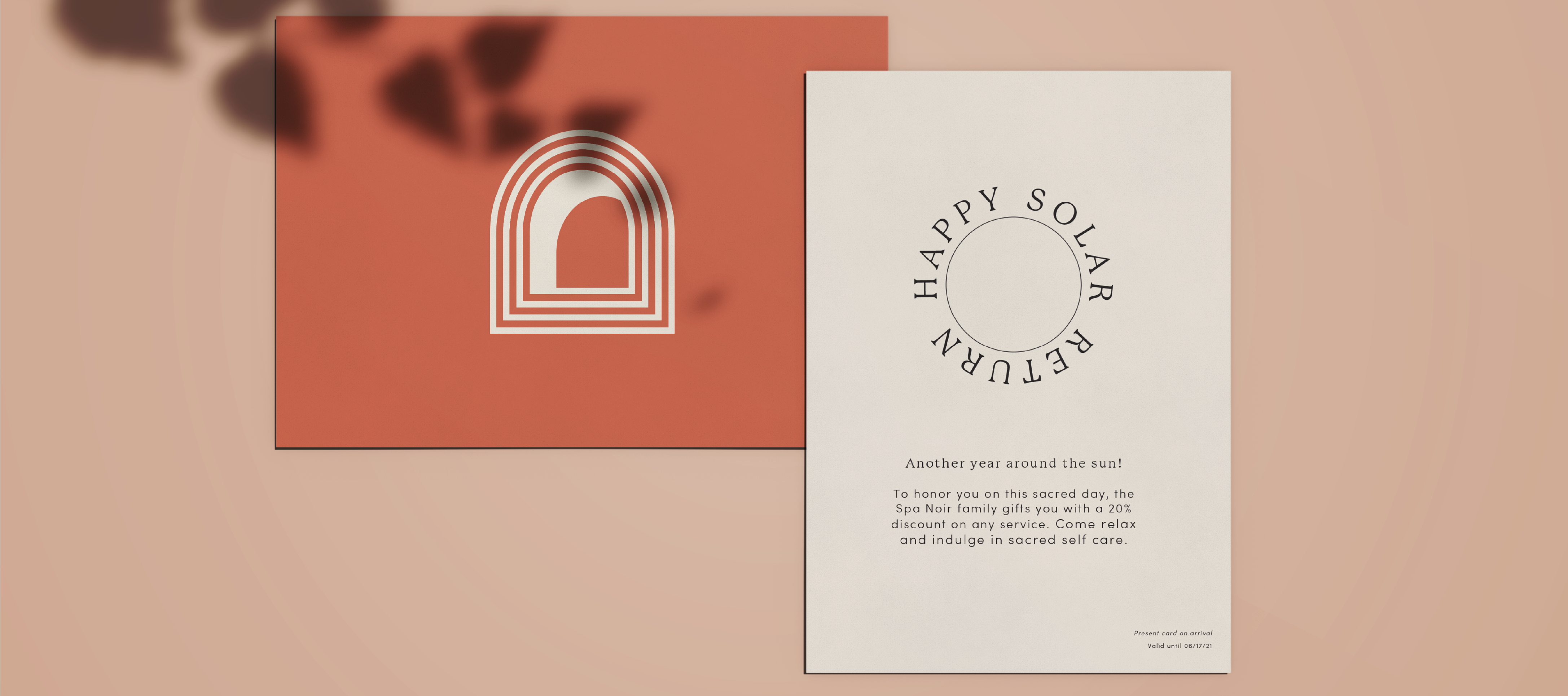
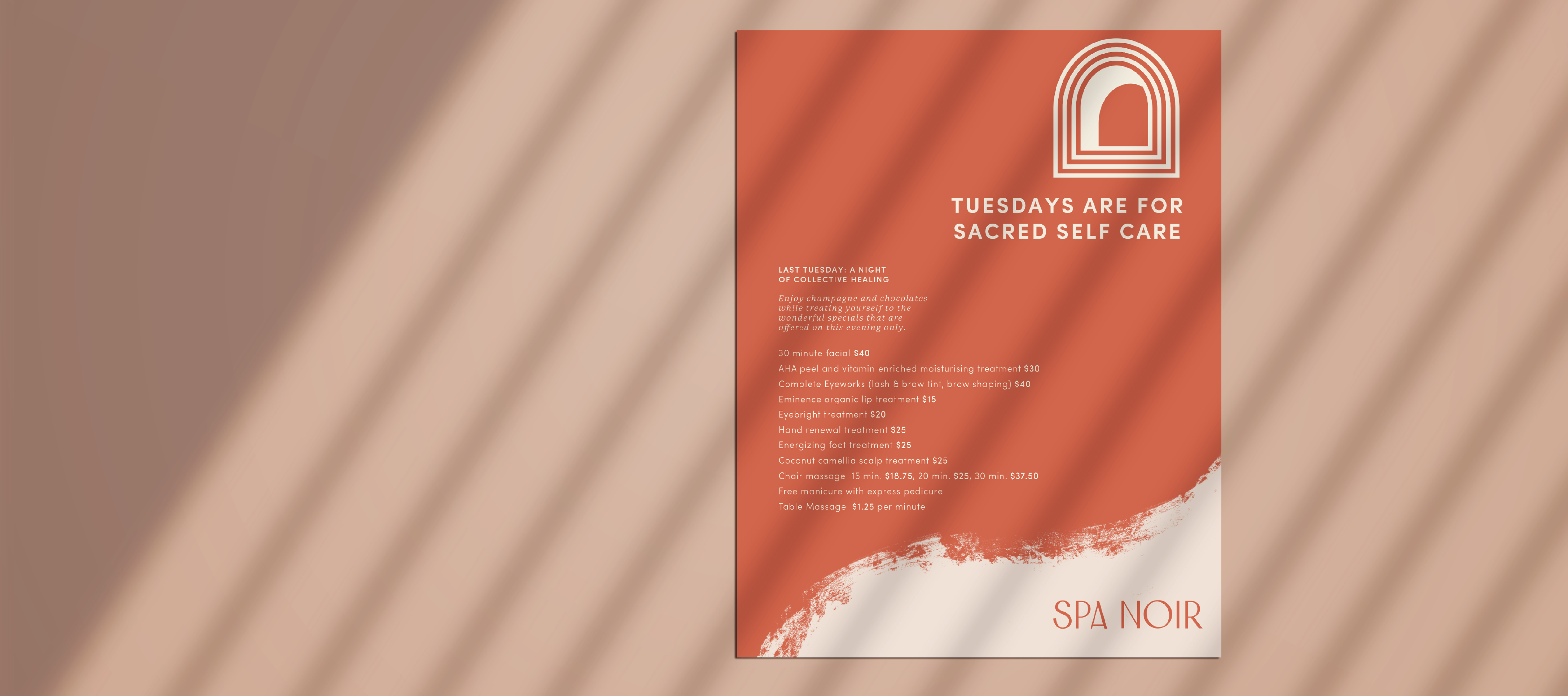
Some additional pieces of print collateral included a mailer that could be sent to residents in the Greater Seattle Area, a birthday discount coupon for existing customer, invites for guests that book private events, and posters to advertise special events such Last Tuesday, monthly event where the Spa offers discounts and as well as some of their more niche events, such as Tarot readings.
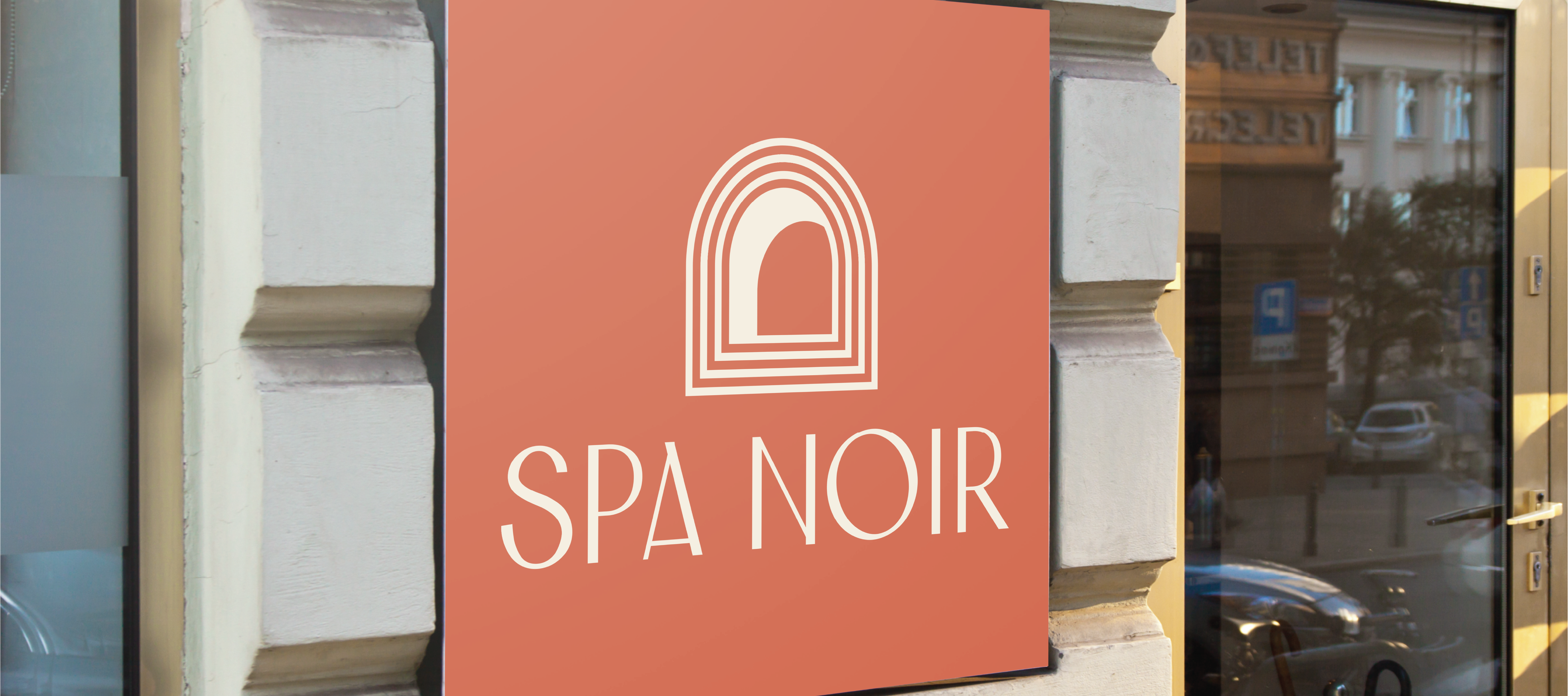
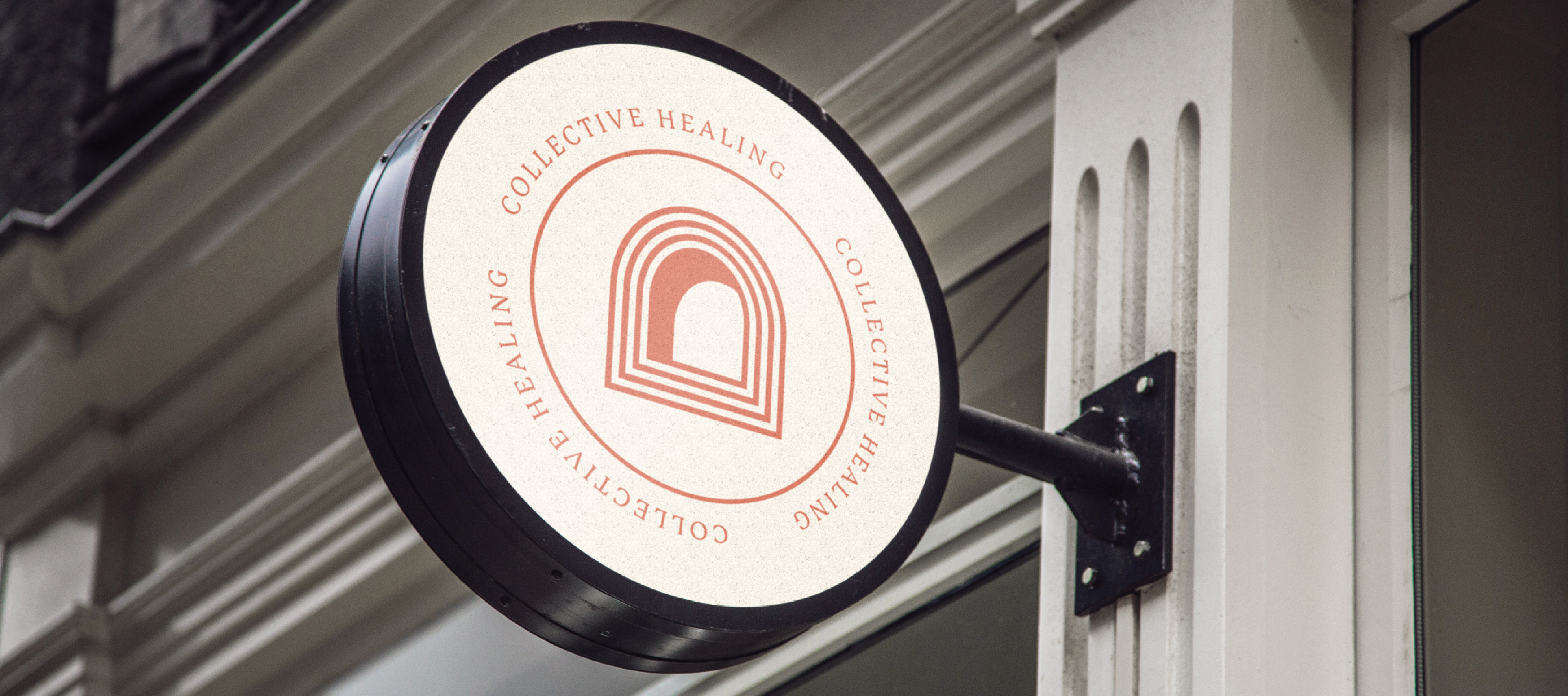
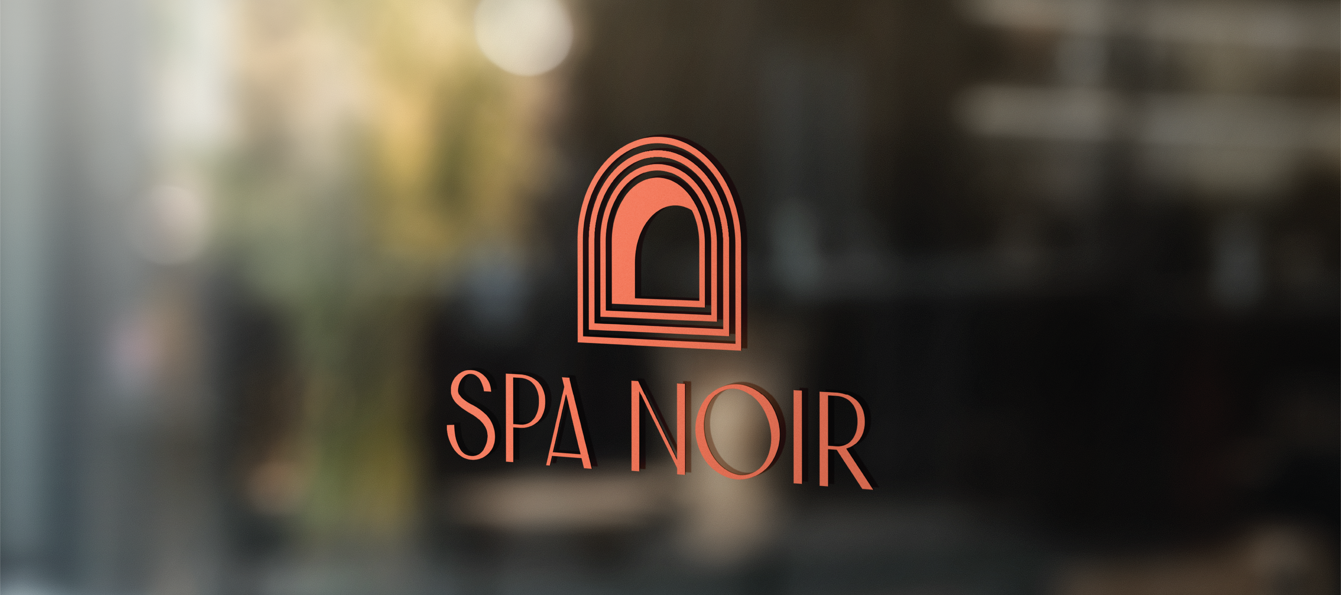
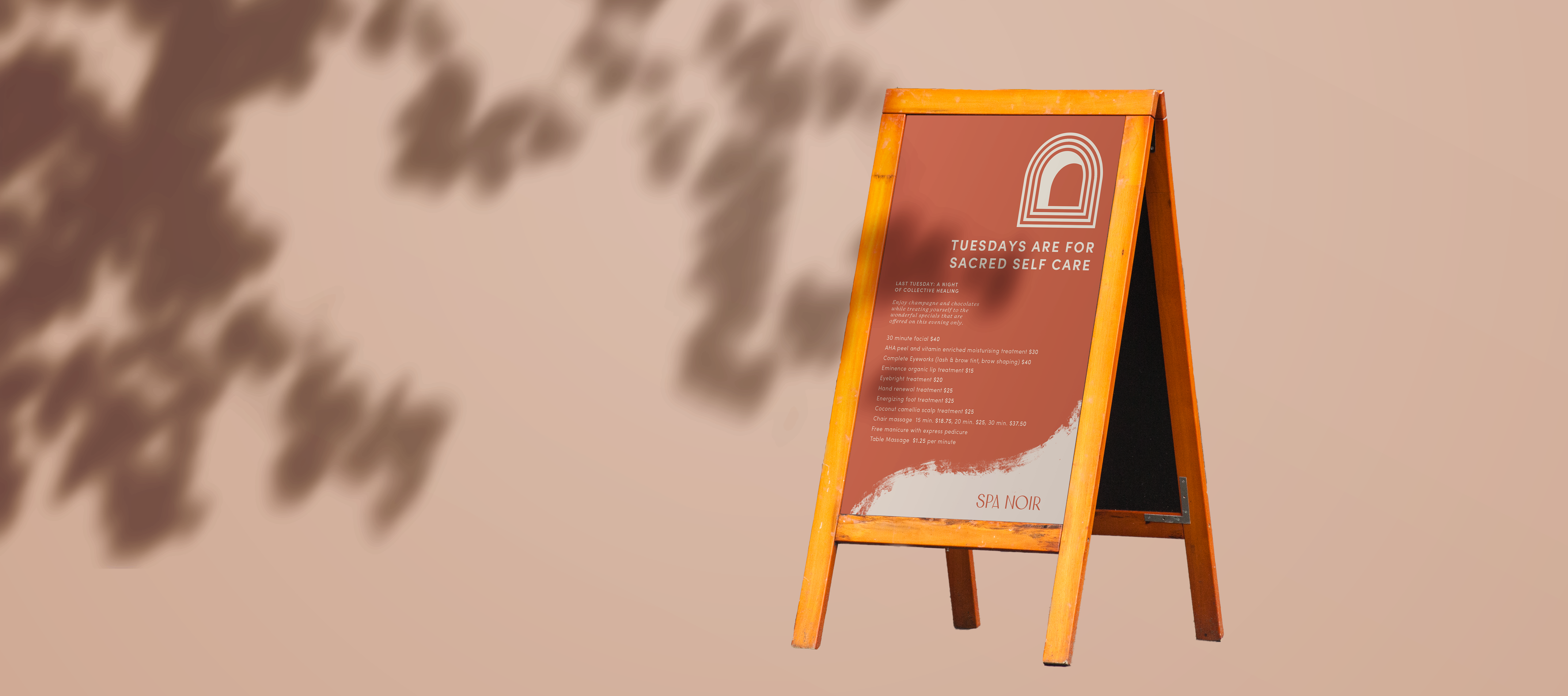
In terms of environmental graphics, four peices I felt would be most necessary was the two points of storefront signage they have, utilization of their floor to ceiling windows for secondary logo display and an A-frame that can be used to advertise special & private events.
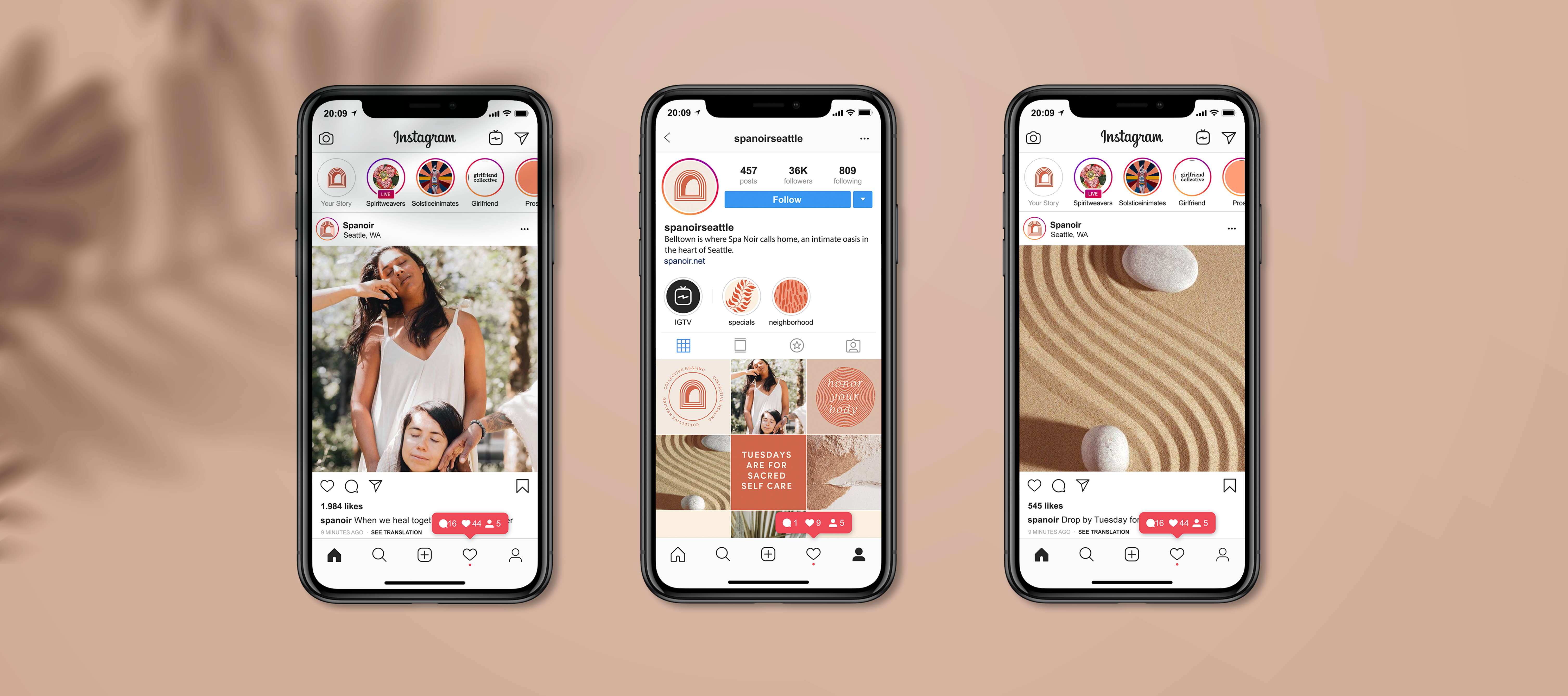
For social we felt that this would a perfect opportunity to showcase the alternative tonal territory that we had previously established. Spa Noir has a certain neo-spiritual undertones the we felt could be communicated through photography direction and messaging.
Finally with the animated logo, I wanted to further illustrate the idea of collective healing. The exterior layers of the window join together form the exterior form of the logo. The way the lines flow together connect create a sense of coming together.
READING
The Overstory
©2025 Brit Van Guilder
©2025 Brit Van Guilder