

TIMELINE
6 weeks
TOOLS
Analog Illustration
Procreate
Illustrator
Photoshop
ROLES
Illustration
Typography
Layout
TEAM
–
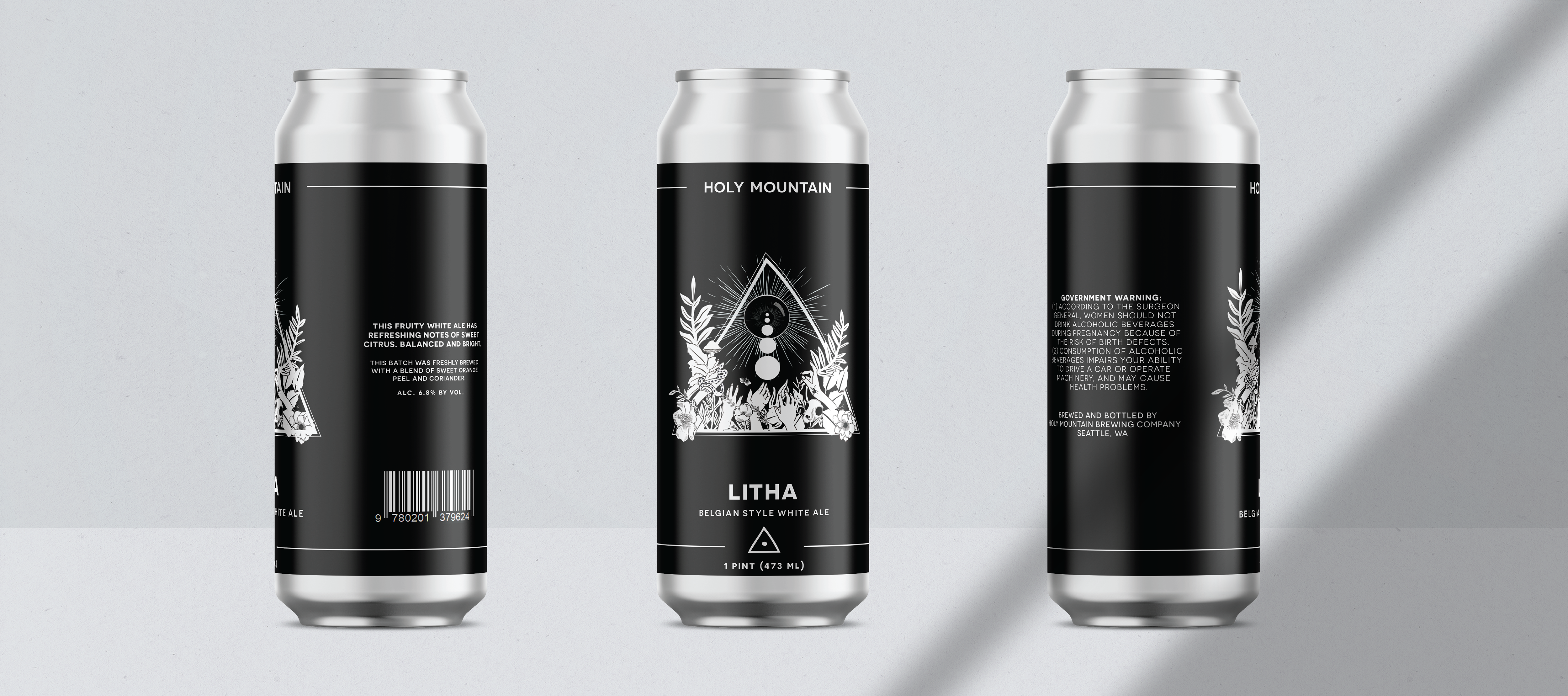
With summer in mind, I moved into brainstorming possible solutions in terms of a visual direction. Because of the occult nature of Holy Mountain’s existing imagery, I was drawn to certain folklore and metaphorical stories as well as the idea of rituals and the pagan religion as inspiration. I began exploring certain concepts related to summer. I came across Litha, which is the pagan holiday that celebrates the summer solstice, worshiping the sun for all that it gives. I felt like this was perfect to pull inspiration from.
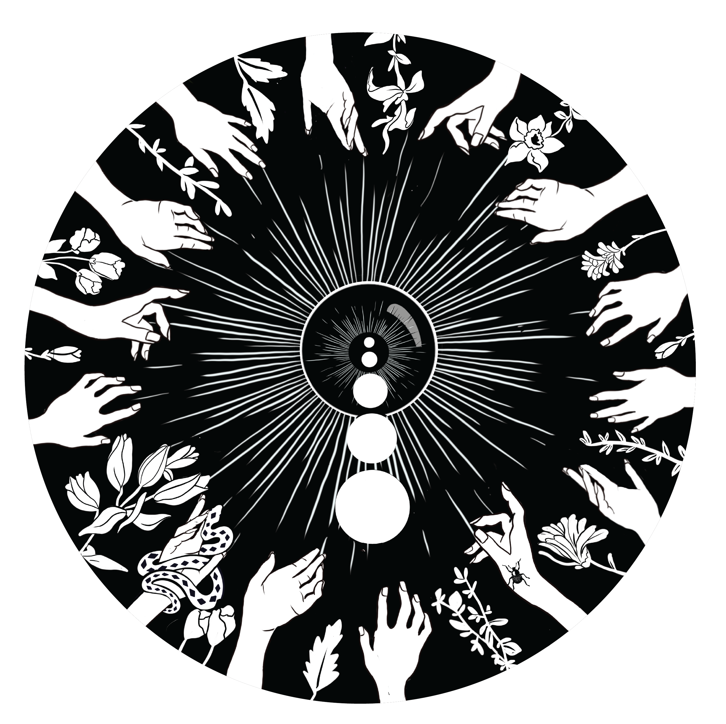
I started out sketching visuals and originally was leaning in the direction of representing Litha as a female figure but I also was drawn to the idea of hands reaching up toward the Sun, a literal depiction of worship. In my exploratory sketches summer foliage was also a visual I played with as well as fire, representing summer heat or summer sun. I took into consideration how I might incorporate other more metaphorical meanings of summer, like death and rebirth.
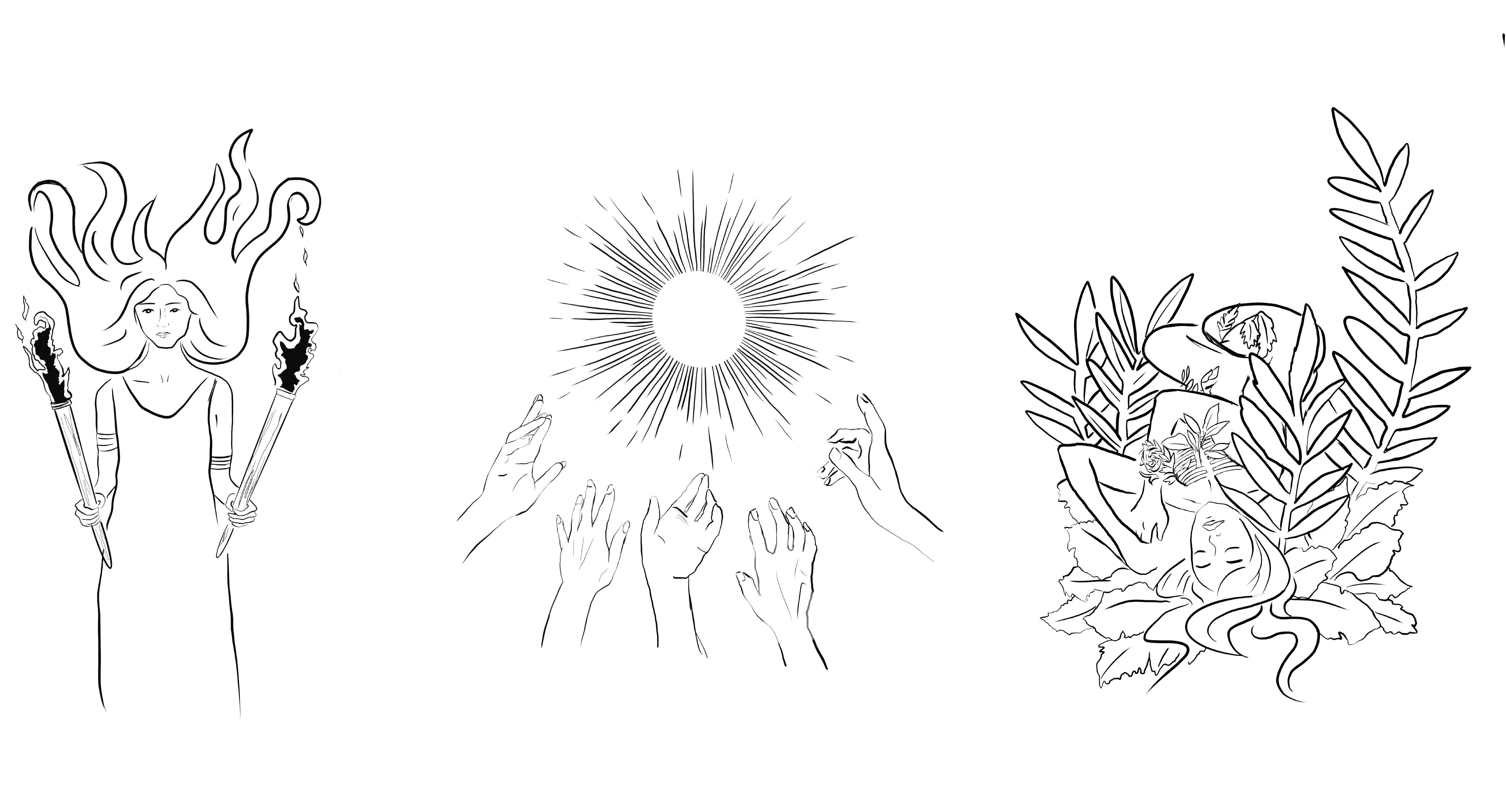

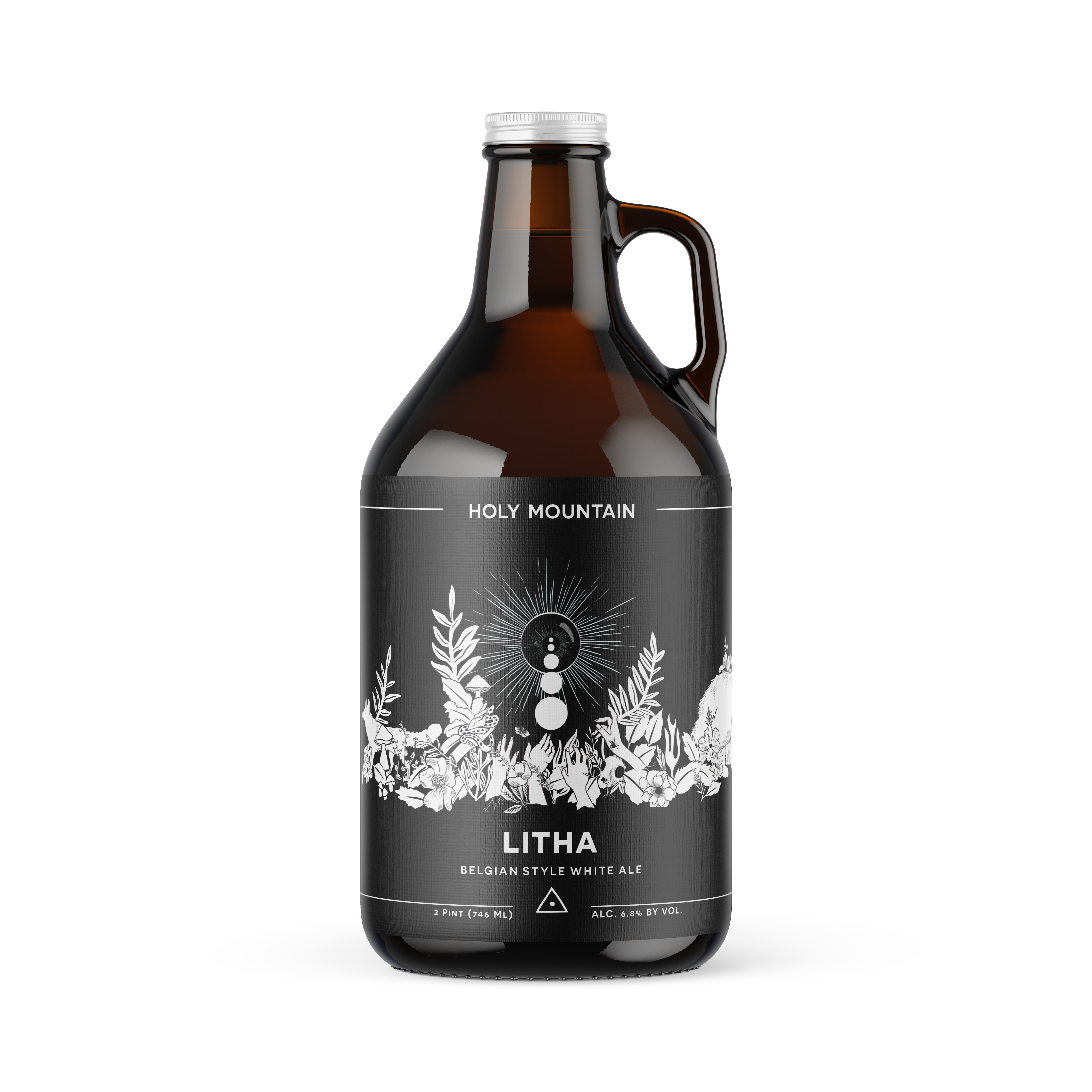
The backbone of the Litha celebration is sun worship, which a more literal depiction of this feeling like the clearest representation. I took the initial illustration and built it out include plants, foliage, insects and animals, all of which flourish in the summer sun.
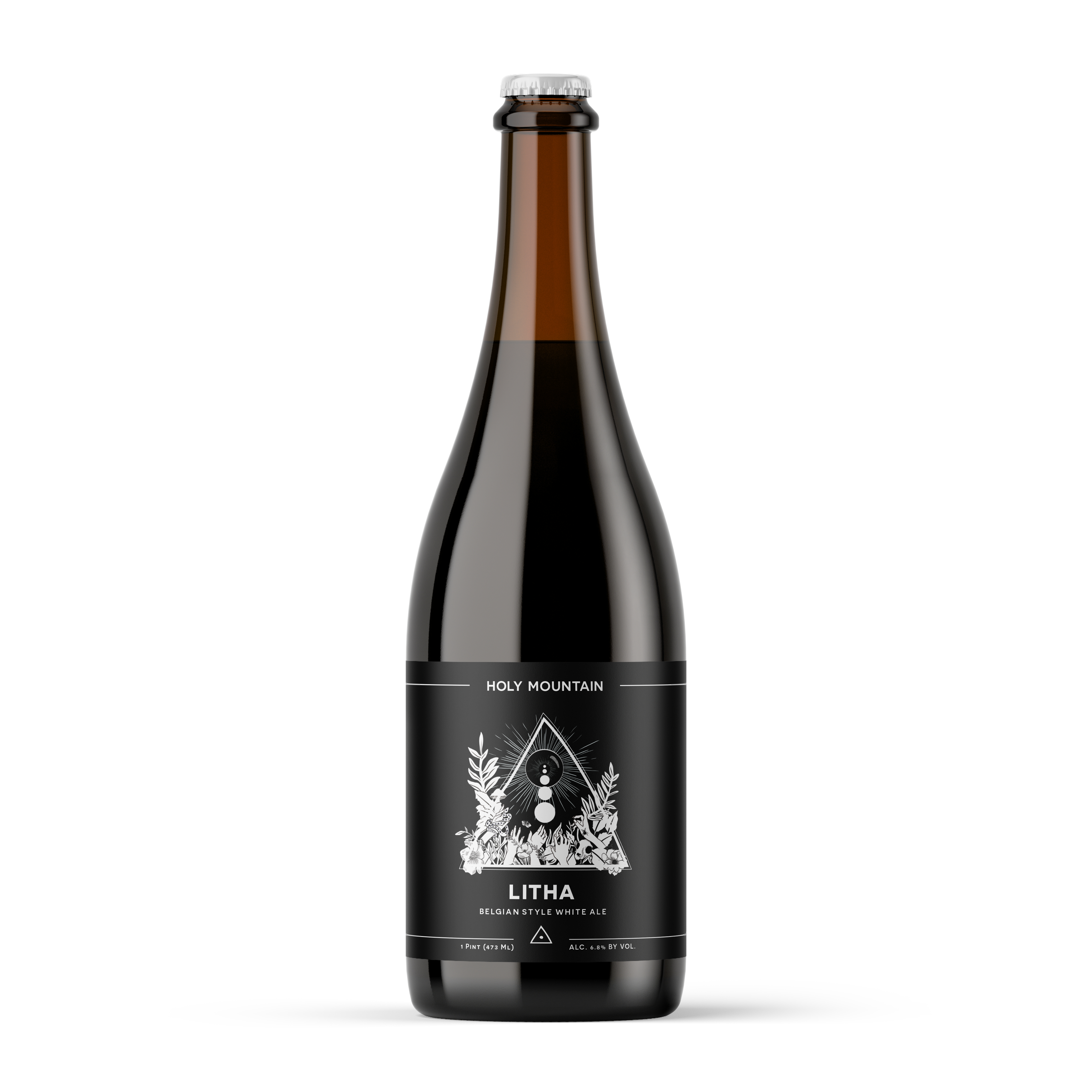
To build on the initial concept, I expanded the imagery to include foliage, wildlife, and insects that flourish during the summertime. Originally, I started with the design of the hands and the sun and built that illustration out further starting with the design for the 22 oz bottle. From there, I took that initial design and made some tweaks and expanded out the foliage and wildlife to tell a bigger story on the growler label.
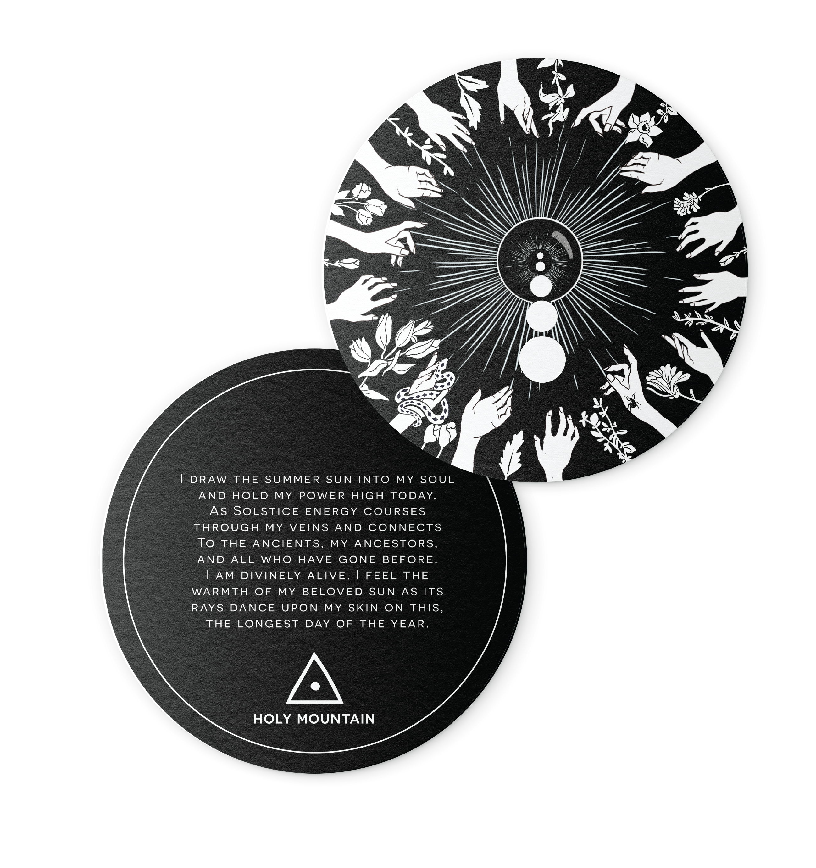
Finally, I took the core concept of the hands reaching out to the sun and wrapped that around the entire coaster to create a coaster imagery.
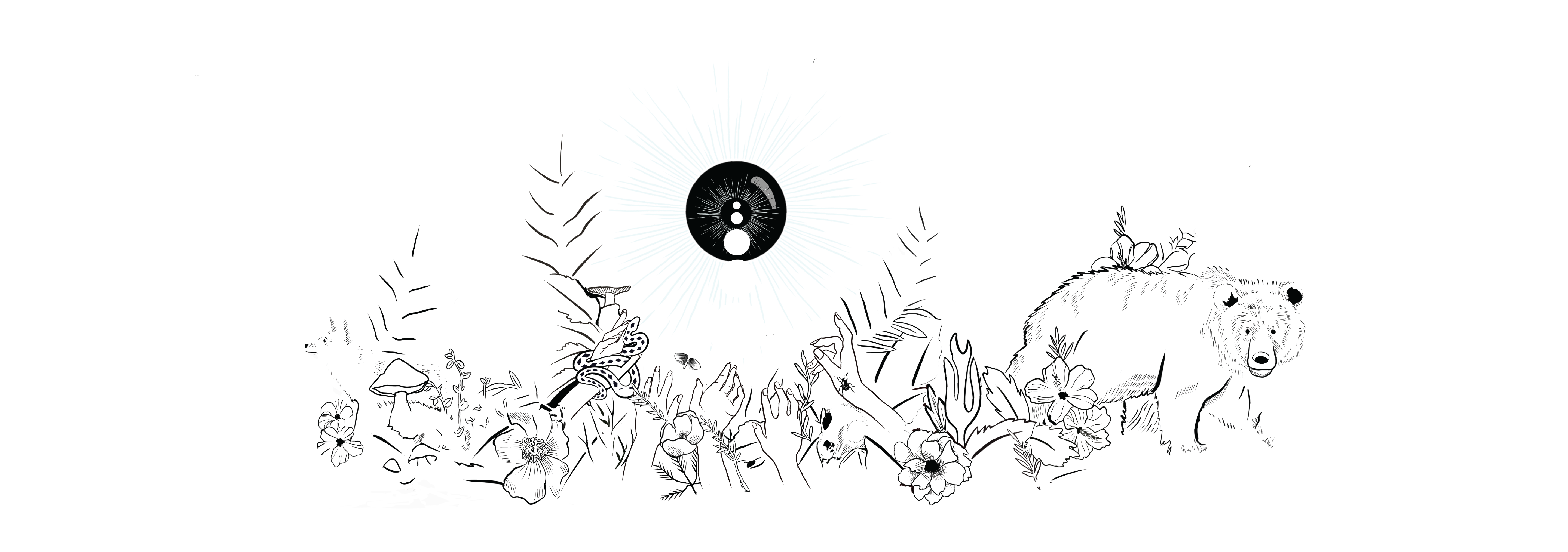 GROWLER ILLUSTRATION
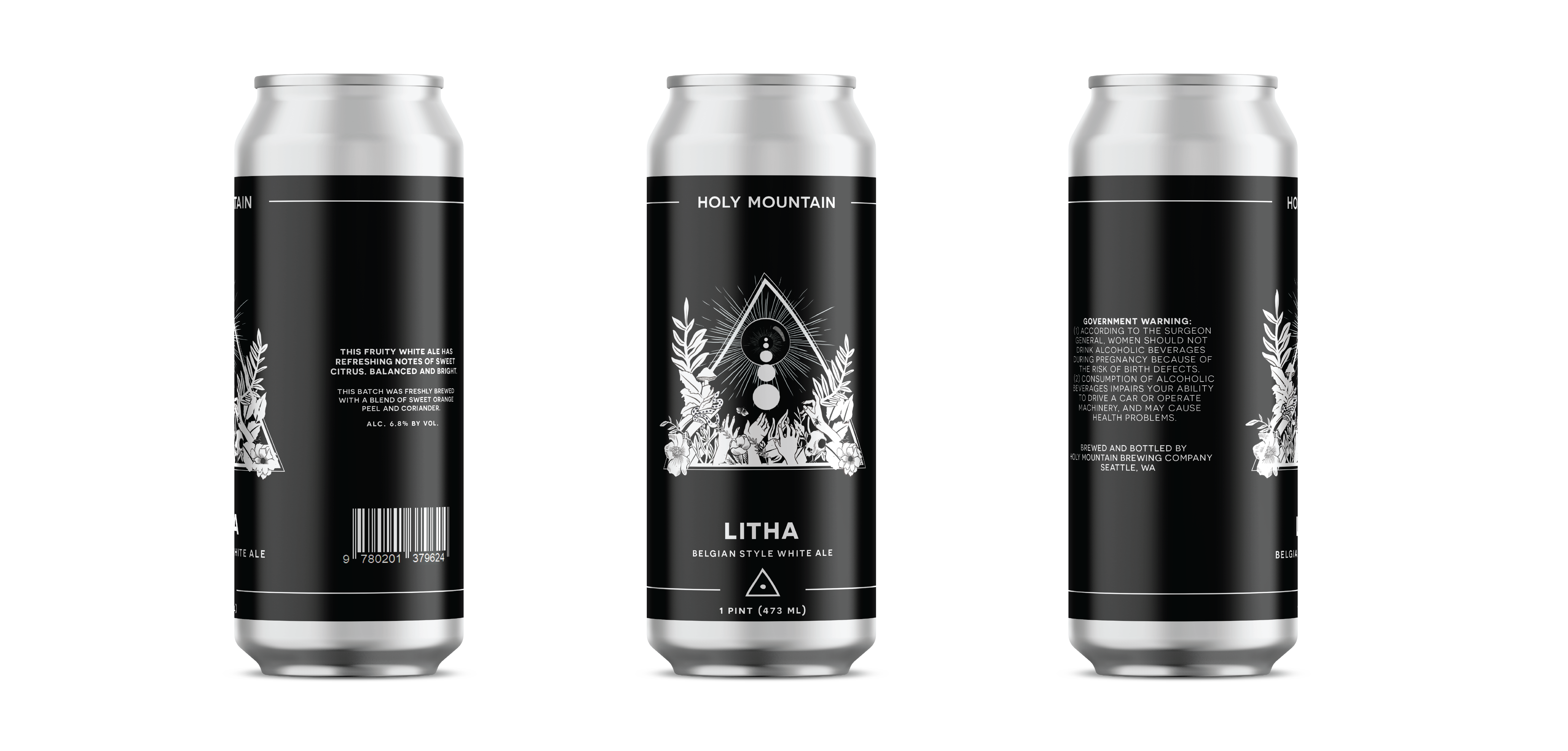
READING
©2025 Brit Van Guilder