

TIMELINE
6 weeks
TOOLS
Notion
Procreate
Illustrator
Photoshop
Figma
ROLES
User Research
Concept Development
Brand Development
Copy Writing
Content Strategy
Concept Development
Brand Development
Copy Writing
Content Strategy
TEAM
Christine Chang
Tyler Sporer
OVERVIEW
Development of a brand concept and business model, identity system, and package design, across multiple platforms such as print, web and social.
We set out to build a brand of body care products that was designed to meet the needs of every type of body. There is opportunity within the marketplace to connect with a specific audience who’s needs have been falling through the cracks of traditional branding and marketing efforts and Every Body is our response. It is a breath of fresh air, for the simple reason that there’s nobody telling you what type of person you should be in order to use it’s products.
We set out to build a brand of body care products that was designed to meet the needs of every type of body. There is opportunity within the marketplace to connect with a specific audience who’s needs have been falling through the cracks of traditional branding and marketing efforts and Every Body is our response. It is a breath of fresh air, for the simple reason that there’s nobody telling you what type of person you should be in order to use it’s products.
RESEARCH
35% of Gen-Z respondents
claim they personally
know someone who uses
gender-neutral pronouns.
Gender-neutral products and marketing strategies are on the rise. There are more examples than ever before of brands moving away from traditional gendered marketing strategies and the data shows that this is being really well received by consumers.
This is be particularly true when it comes to the Gen-Z and millennial aged audience. We’re living in a time of shifting cultural and political norms and this generation is advancing us towards a more androgynous and gender fluid future. In a 2018 pew research poll, 12% of millennials identified as transgender or gender non-conforming, and 35% of Gen-Z respondents claim they personally know someone who uses gender-neutral pronouns. These are not insignificant segments of the population. With this shift comes the opportunity to craft a narrative that builds a closer, more personal relationship with these consumers and one that better reflects their personal values.
This is be particularly true when it comes to the Gen-Z and millennial aged audience. We’re living in a time of shifting cultural and political norms and this generation is advancing us towards a more androgynous and gender fluid future. In a 2018 pew research poll, 12% of millennials identified as transgender or gender non-conforming, and 35% of Gen-Z respondents claim they personally know someone who uses gender-neutral pronouns. These are not insignificant segments of the population. With this shift comes the opportunity to craft a narrative that builds a closer, more personal relationship with these consumers and one that better reflects their personal values.
THE PROBLEM
Gender biased body product brands reinforce gender stereotypes and create gender inequality within the consumer marketplace, which leads to a gap in inclusivity and failure to address the personal needs of all people. While gender neutral brands exist, more often than not they tend to lack personality and relatability. Additionally, there has been an erosion of trust that has come as a result of traditional brands' lack of concern about the use of harmful ingredients.
AUDIENCE
Our research showed that millennials and Gen Z were the most overlooked when It came to representation in the body products industry. We wanted to build a brand that spoke to these particular demographics. We developed two relevant personas to better understand the wants and needs of this demographic.
Anthony,
a 19 year old College Freshman.
Anthony is a part time barista & contemporary dancer
that loves people, culture, art. He enjoys exploring
new trends and products. He is an advocate for
LGBTQUIA+ rights and regularly participates
in social movements. He loves personal care, but
doesnt want to support brands that polarize gender.
Brooke,
a 35 year old software developer.
Brooke left her corporate job a few years ago to
freelance because she wants a more flexible lifestyle.
Recently she started to be more mindful about things
and the product she purchases has always been
aware of environmental issues but she feels unsure
around what indivdual actions sh can take. She’s tired
of pink tax, and purchasing different brands than her husband.


OUR MISSION
Every Body creates personal care products fit for every kind of human. Ethical, Inclusive, and sustainable, we want to empower all people to explore their personal needs and practice self care without having to think twice what’s in the bottle or what they’re being labeled as.
STRATEGY
“We felt drawn toward the use of
abstract and organic shape, and
developed a color palette that is
diversified enough to not feel
overly masculine or feminine.”
Every Body focuses on personal needs and uses objective language to describe product benefits to create a more inclusive brand that better aligns with our target audience’s values. Every Body maintain’s integrity in our ingredients, developing environmentally responsible and thoughtful packaging solutions.
During our brand exploration we found a handful of guiding values that we used to build a strong foundation for a gender neutral brand that we believe differentiates itself from what’s currently out there. We found the use of large type on packaging as an ideal way to lead with the message, and exercise ambiguity in our verbal tone and visuals to communicate that our products are for all types of people and bodies. We felt drawn toward the use of abstract and organic shape, and developed a color palette that is diversified enough to not feel overly masculine or feminine.
INCLUSIVE
We acknowledge the differences in our body, skin and hair types, and that our individual needs can only be met through a personalized line of body products. Anything short of that, we ran the risk of marginalizing and excluding certain groups.
HONEST
Everybody is honest and has integrity in order to build trust with our customers. We offer ingredient transparency and consider brand impact by integratingpackaging solutions that consider our environmental and ethical responsibilities.
YOUTHFUL
Though there are no age restrictions to the use of our products, we built youthfulness into our line through our use of color, illustration and our vocal tone. A youthful visual direction is more inviting and approachable, aiding in inclusivity.
DESIGN SYSTEM
The letterforms in Every Body
are composed with different stroke
styles, weights, and sizes. We
believe this successfully delivers
the message that our brand
celebrates every kind of body.
Approaching our design system, we found the use of large type on our packaging as an ideal way to lead with the message. We felt drawn toward the use of abstract and organic shape with subtle imperfection which visually represents embracing different body types and our own imperfections
Typographically we chose neutral typefaces. P22 Mackinac Pro has a general-purpose, utilitarian design that is stable and trustworthy, yet its softly rounded terminals makes it friendly and inviting. Hk Grotesk is an equally friendly and distinguishable typeface ideal for small text and body copy.
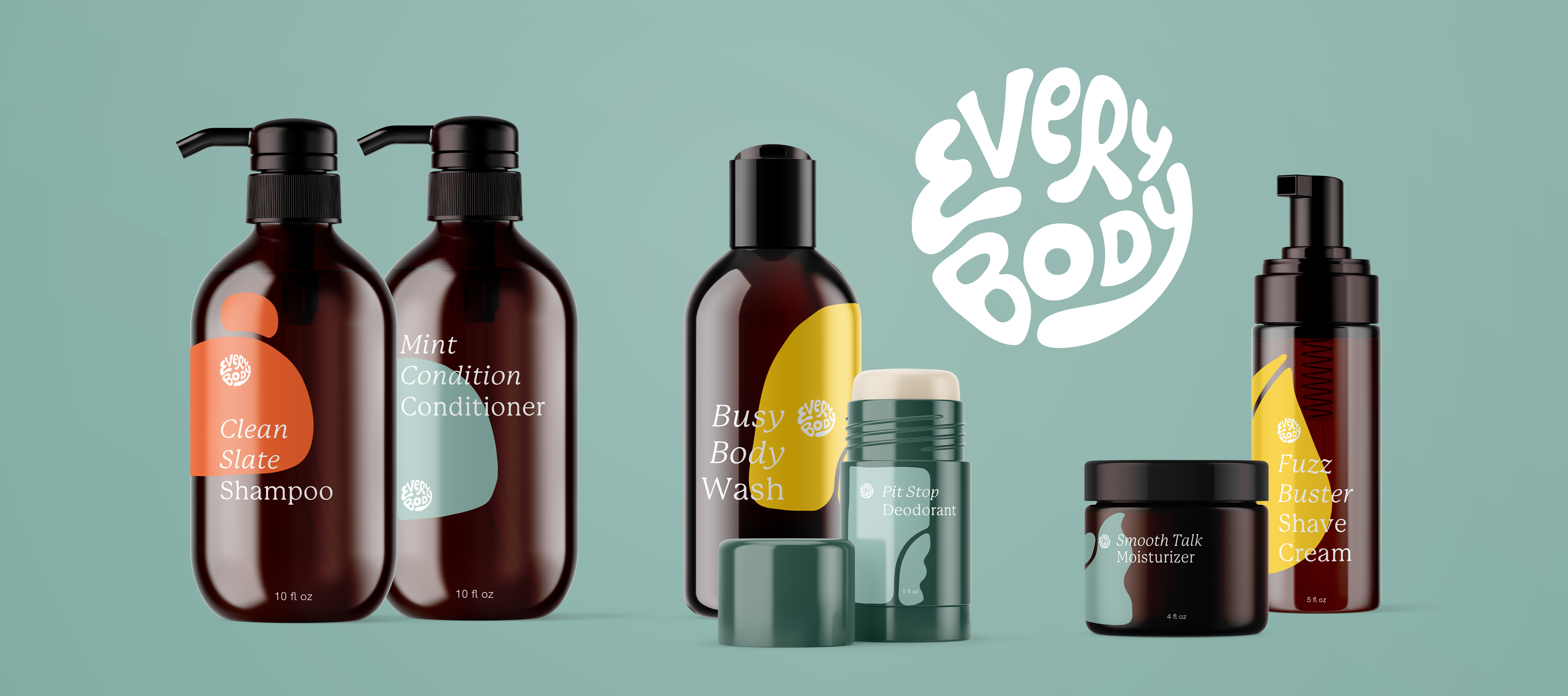
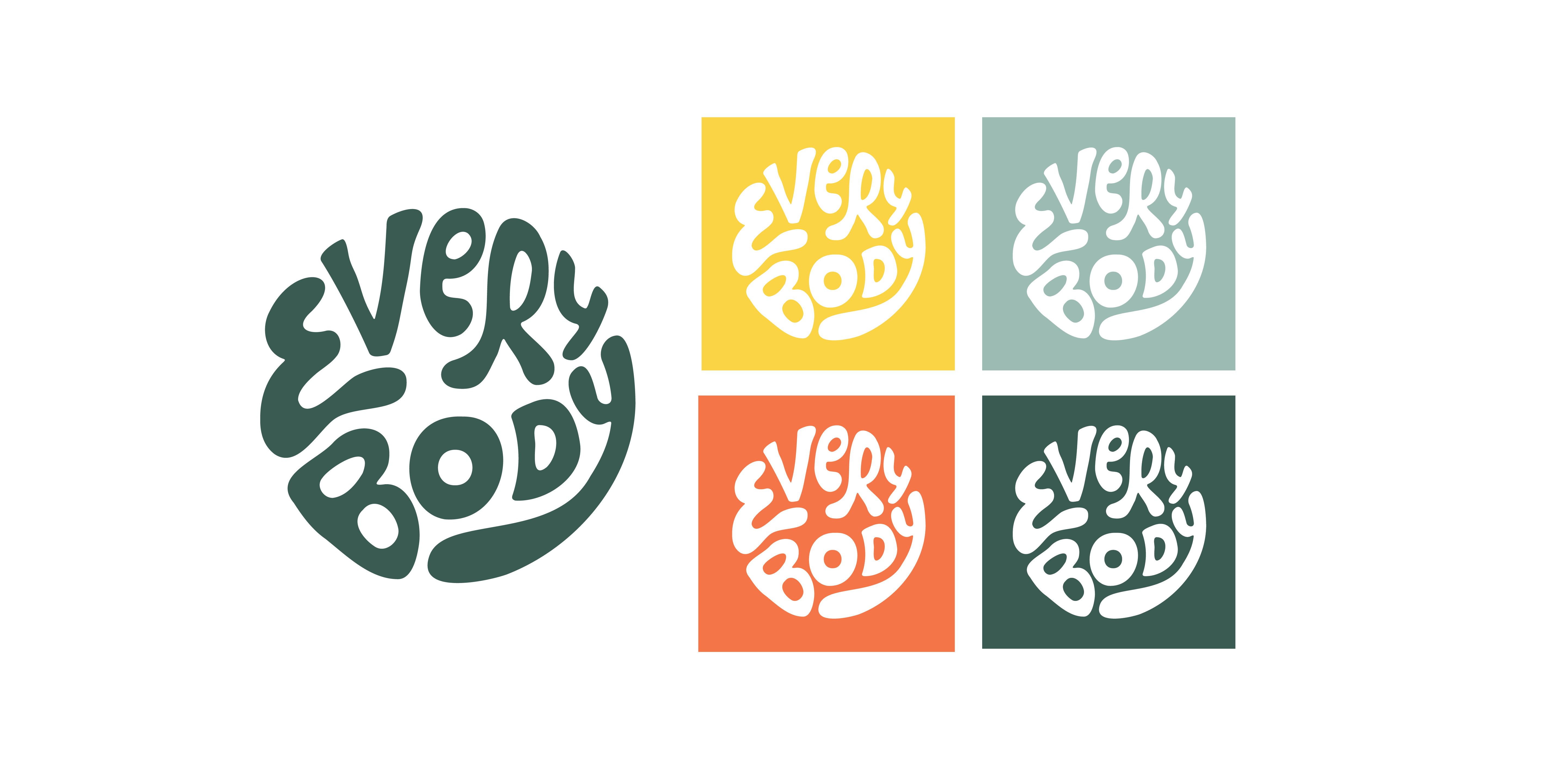
We developed a suite of shapes, each with two shapes interacting to offer some variance and with each shape. Our brand colors offer a customization option for our customers. During the ordering process, customers can select which color label they would like for their line. We thought this may be important for those that live in the same household that both have customized products but need a way to differentiate whose product is whose.
The Every Body wordmark is composed with different stroke styles, weights, and sizes. We believe this successfully delivers the message that our brand celebrates every kind of body. And by putting the letters into a circular shape, it speaks to the fact that that our brand is inclusive and unifying. You can scroll through alll components below.


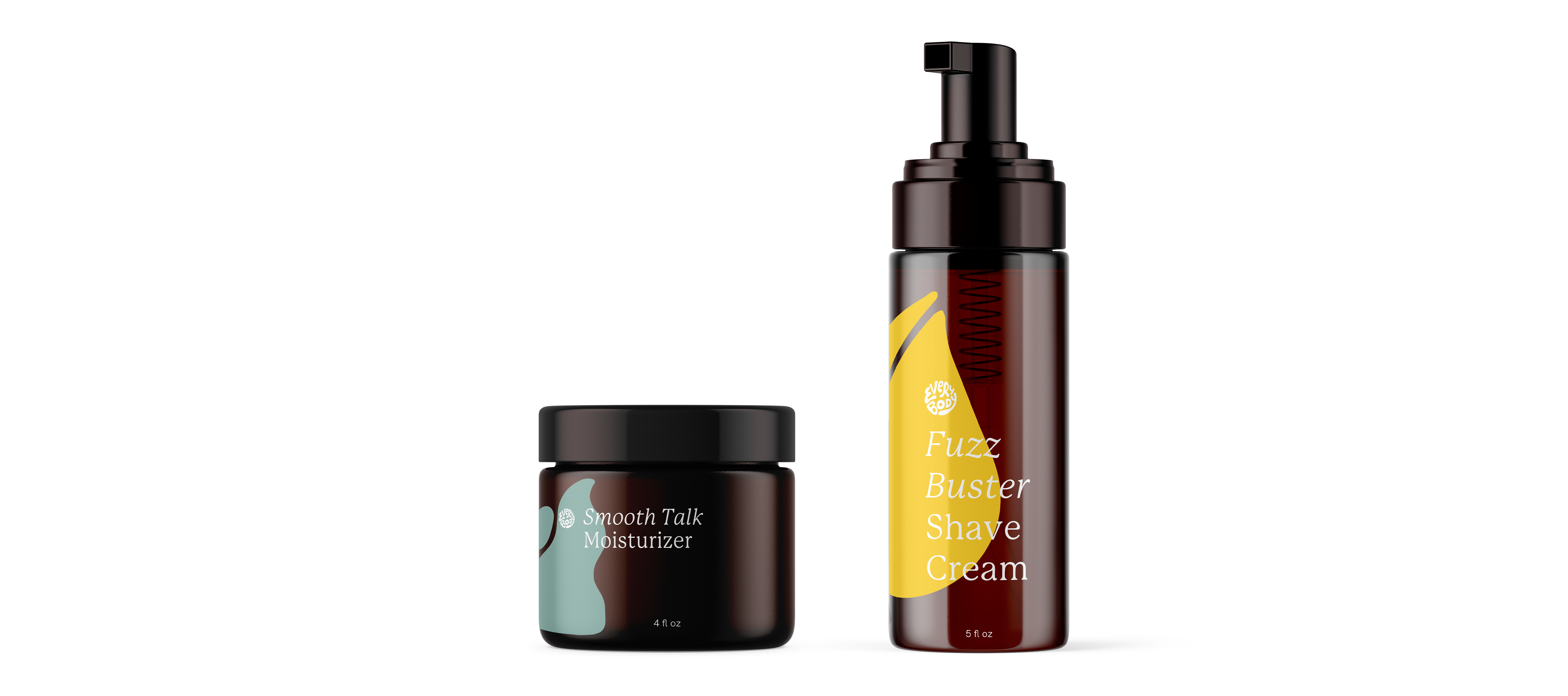
PACKAGING
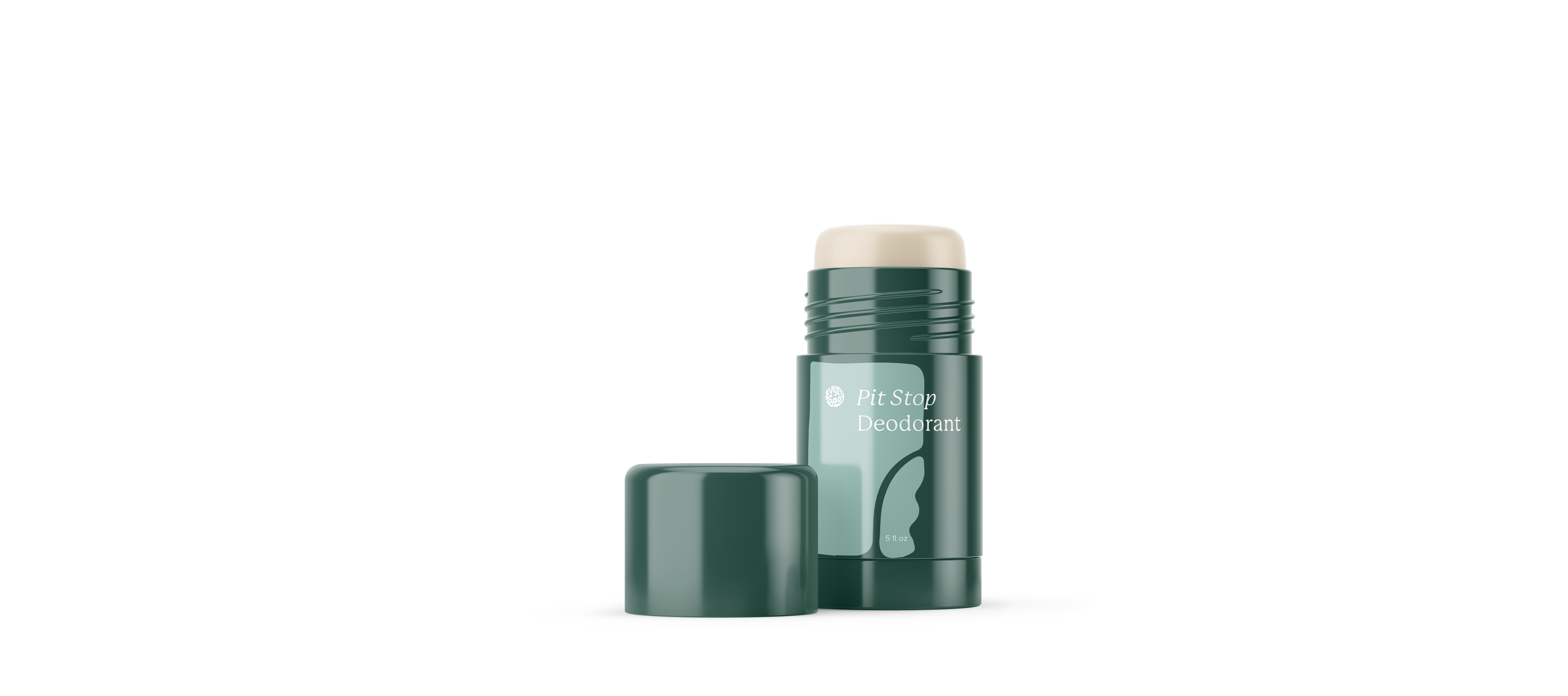
For the packaging of our products, we combined our large offset shapes with the overlapping product name. We intentionally minimize the presence of our logo to lead with the playful and functional product name, which aids in a youthful tone. This is our way of showing that we’re dedicated to put our user’s needs first rather than the brand. Below our our suite of six products.


.
Our persona Brooke’s user story established the need of sustainable solution. As a brand, we felt that in order to say that we are honest and inclusive, we not only have to consider the people using this product, but also its impact on environment. Our refill cartons are mostly made of paper, and sometimes even recycled paper, making the environmental impact much less and easier to recycle.

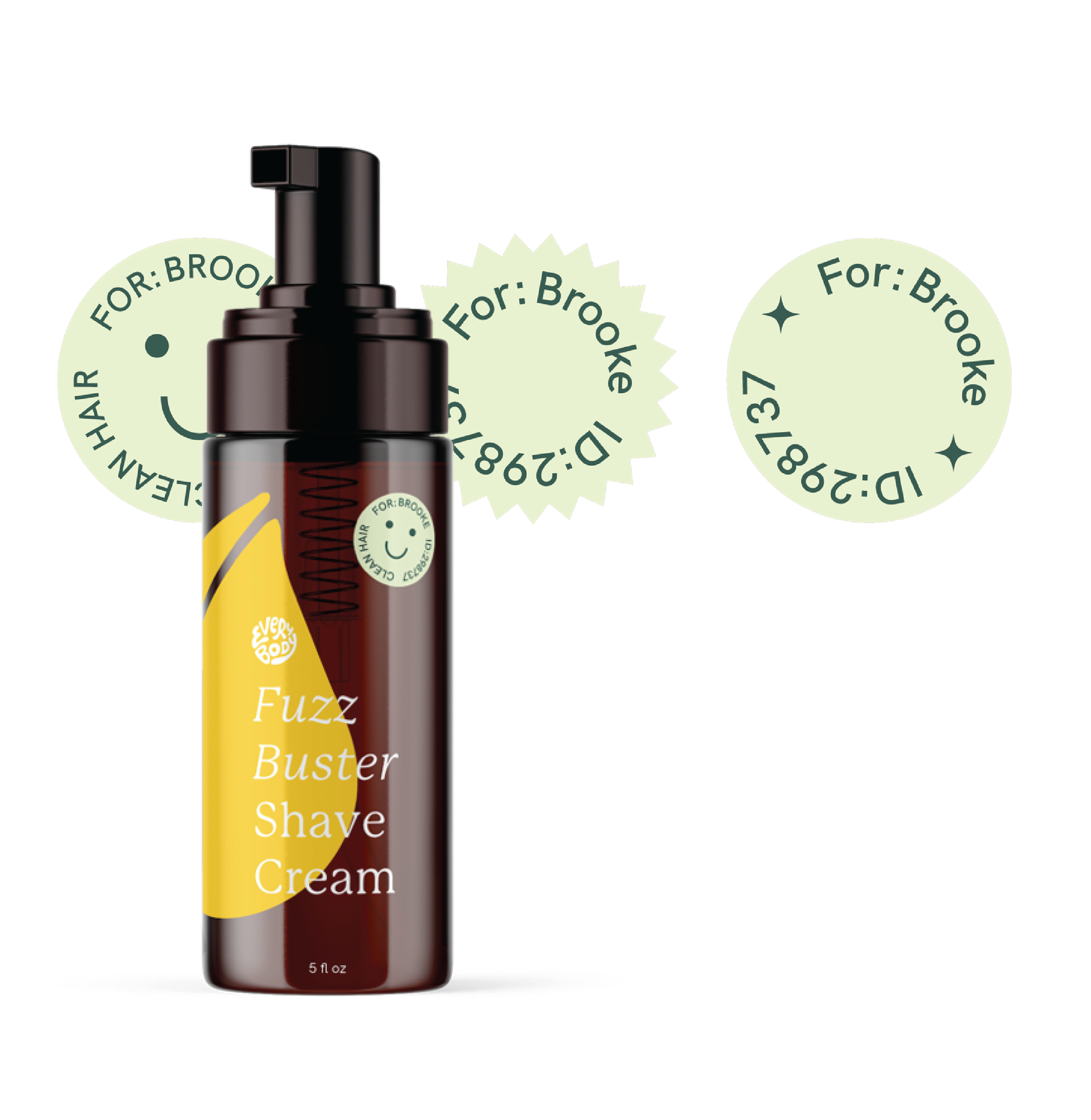
We considered how we can also lower the impact of labels for a personalized product. creating custom label and bottle designs for each customer’s order wouldn’t be cost effective or environmentally responsibile. We felt like it’s not sustainable and it’d require our customer to pay a premium because of packaging production. To avoid that, we decided to keep the label consistent on all packaging and use small stickers to identify the customer and formula ID’s so the bottle is filled with correct formula.
For shipping box we stuck with the monochomatic green color palette we have across our branding. Becuase this would be the first physical interaction with Every Body Products we felt having brand message up front and accessible was a good first touchpoint.
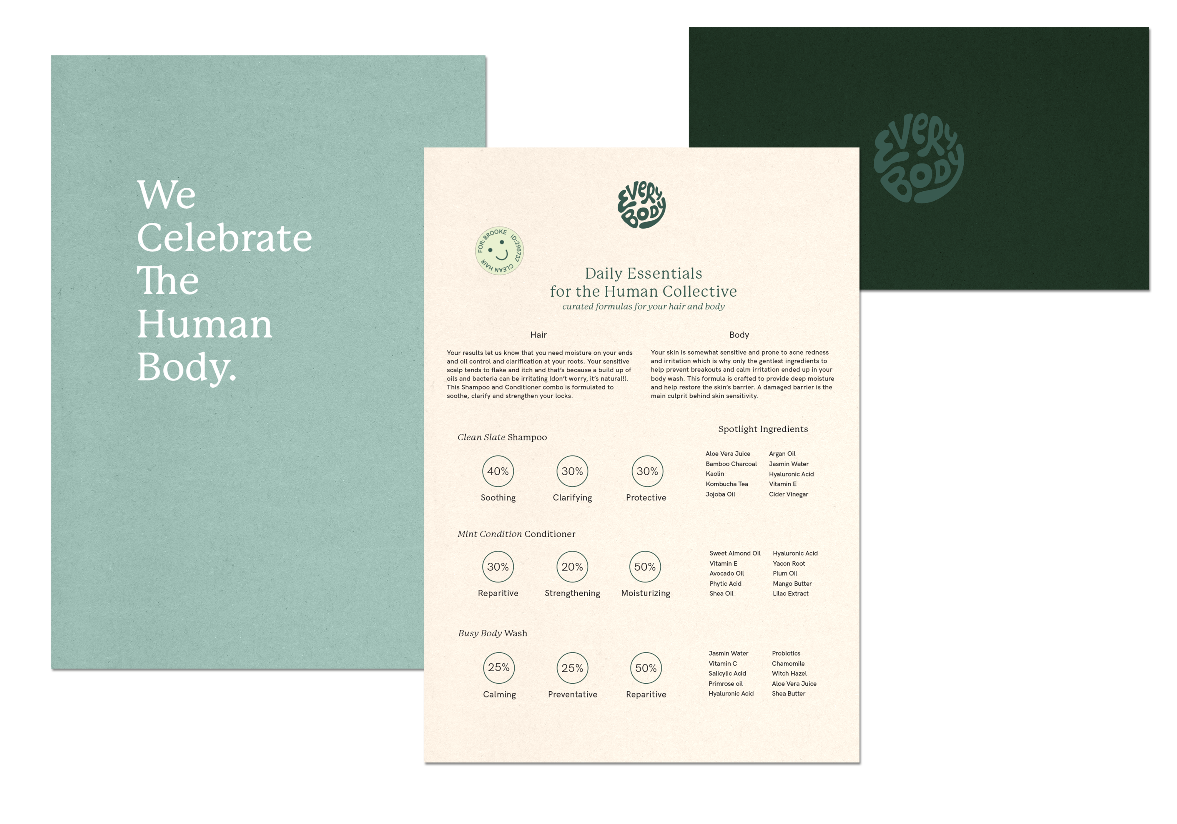
Since we don’t have extensive copy on our bottles, we utillized a nicely designed packaging insert to provide a breakdown of key ingrredients in each product they’re receiving. We also provide insight as to why those ingredients work for theeir particular make up, and a percentage based breakdown of how the these products are fulfilling your body care needs.
CONTENT STRATEGY
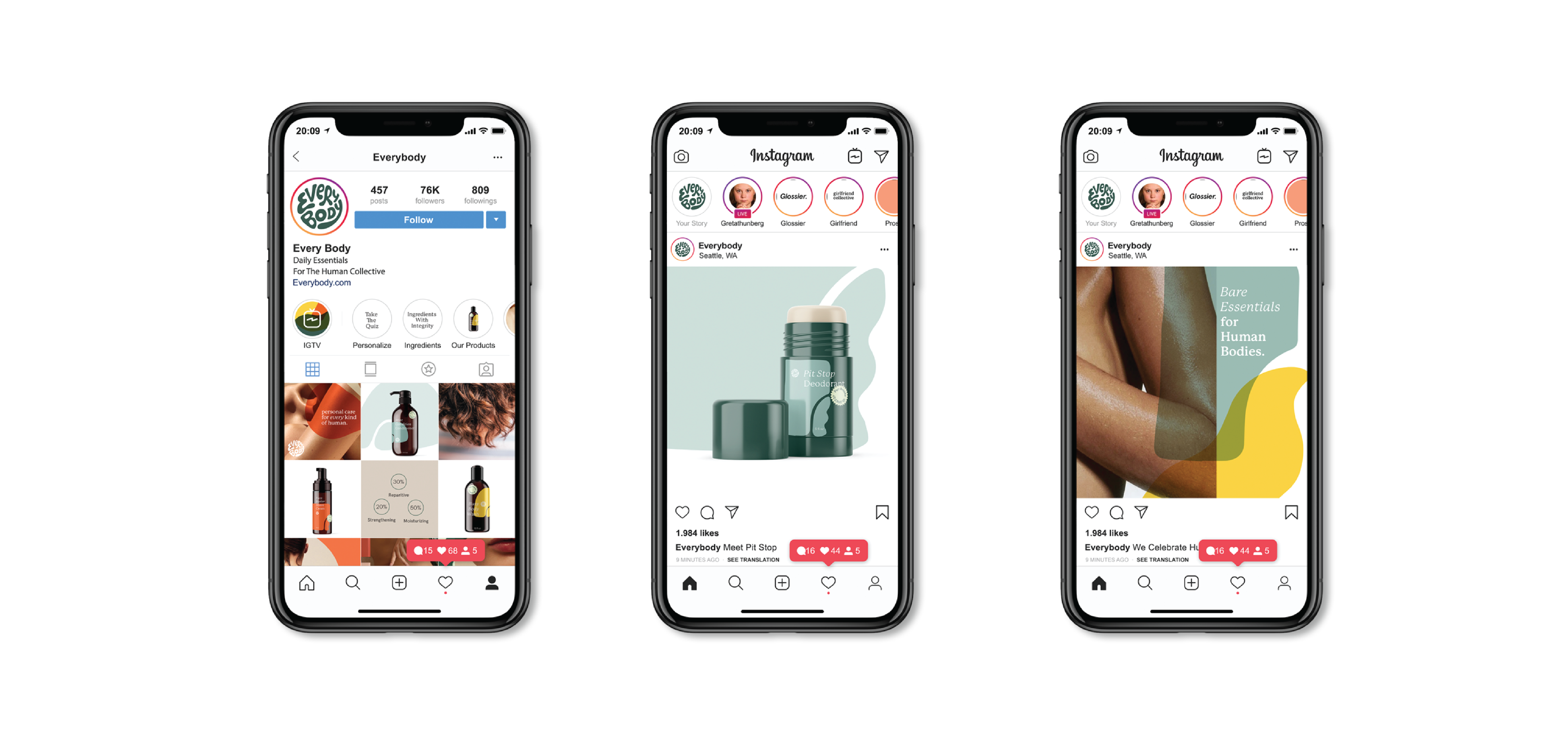
For social media, we aimed for most of our photography to be ambiguous that includes close up body and hair shots without a clear indication of gender, race, or identity. We see social as an opportunity to build a narrative and personality for our brand. We expect our social media to be the first touchpoint for a lot of new customers, so we also put in product shots to get the audience familiar with our brand’s visual identity.
WEB
“It was important to present the
audience with our personalized care
quiz, which is really at the core of
our business model.”
Our business model will be driven by online retail, so we really wanted to dial in our web experience. The key component to the web experience is the quiz, which asks a series of questions that gathers information about the users body and hair type. based off of those results the user is provided with their personal ingredient recommendations for each product.
Overall the web experience is tailored towards usability, wit the whole process aimed at prompting the user to take the personalization quiz.
Overall the web experience is tailored towards usability, wit the whole process aimed at prompting the user to take the personalization quiz.
On our landing page present the packaging right off the bat, and lead with our tagline, Daily Essentials for the Human Collective. From here, we thought it was really important to present the audience with our personalized care quiz, which is really at the core of our business model.
With the quiz it was really important to use to not attach racial or gendered stereotypes to any of the questions. They were aimed at getting a better sense of an individuals needs and personal struggles when it comes to body and hair products.

READING
The Overstory
©2025 Brit Van Guilder
©2025 Brit Van Guilder