

TIMELINE
8 weeks
TOOLS
Procreate
Illustrator
Photoshop
ROLES
Illustration
Typography
Layout Motion
Photography
TEAM
Christine Chang
Kathreen Absuelo
OVERVIEW
Black Wulff Co was a newly emerging seasoning company, by Marcellus Rochon. His recipes are based on Rochon family recipes, passed down generation to generation for over 200 years. This project required aspects of market analysis, brand development and package design. The final product consisted of a fully developed brand system, product photography, label system and 50 distinct bottle labels.
CONTEXT
Black Wulff Co is the go to seasoning blends in every home cooks arsenal. Black Wulff delivers traditional, bold flavor profiles without compromising product integrity through use of harmful additives or excess salt. Instead, Black Wulff Co use only fresh, organic ingredients and product blends. Expertly crafted with care and intention, we believe great food holds the power to cultivate connection around the table.
The Rochon’s are a true old family of New Orleans, residing in the city since 1797, less than 80 years after its founding the roots of the Rochon family tree run deep. With family ties to France, Quebec, Alabama, St. Domingue (Haiti), and Louisiana the cultural and culinary inspirations of the Rochon’s are vast. Just as faith, family, food, and music are the foundation of the creole community, influence runs deep in this bloodline.
The Rochon’s are a true old family of New Orleans, residing in the city since 1797, less than 80 years after its founding the roots of the Rochon family tree run deep. With family ties to France, Quebec, Alabama, St. Domingue (Haiti), and Louisiana the cultural and culinary inspirations of the Rochon’s are vast. Just as faith, family, food, and music are the foundation of the creole community, influence runs deep in this bloodline.

MISSION
Black Wulff Co brings the traditional flavors of creole cooking into every kitchen. They encourage exploration of the creole culinary traditions, educate on the vast depth and contributions of Blacks to the American landscape, and restore land ownership to Black agriculturist within North America. You can view and indepth UX and SWOT analysis here︎.
VISION
To inspire fellowship and community
through the art of cuisine.
DESIGN SYSTEM
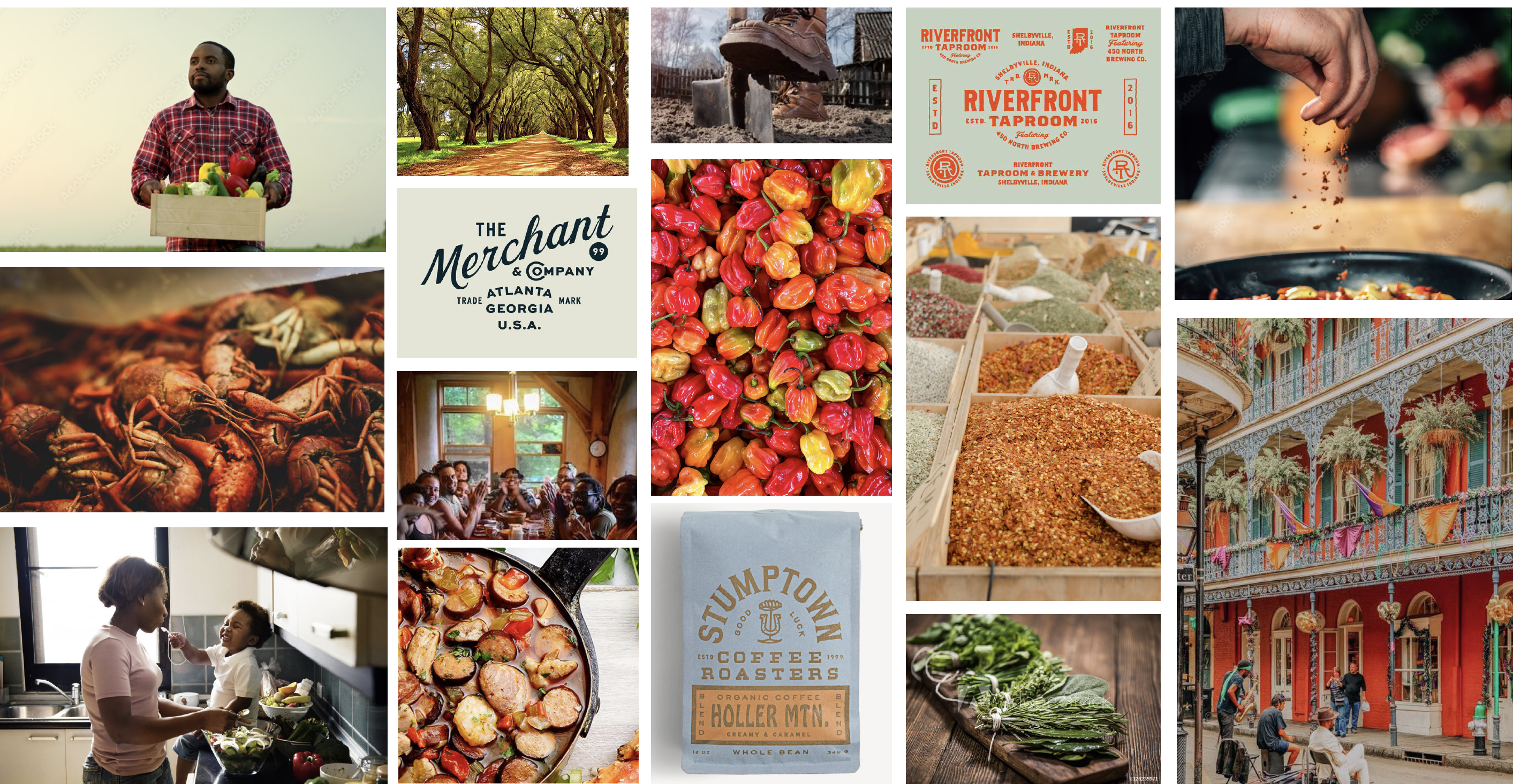
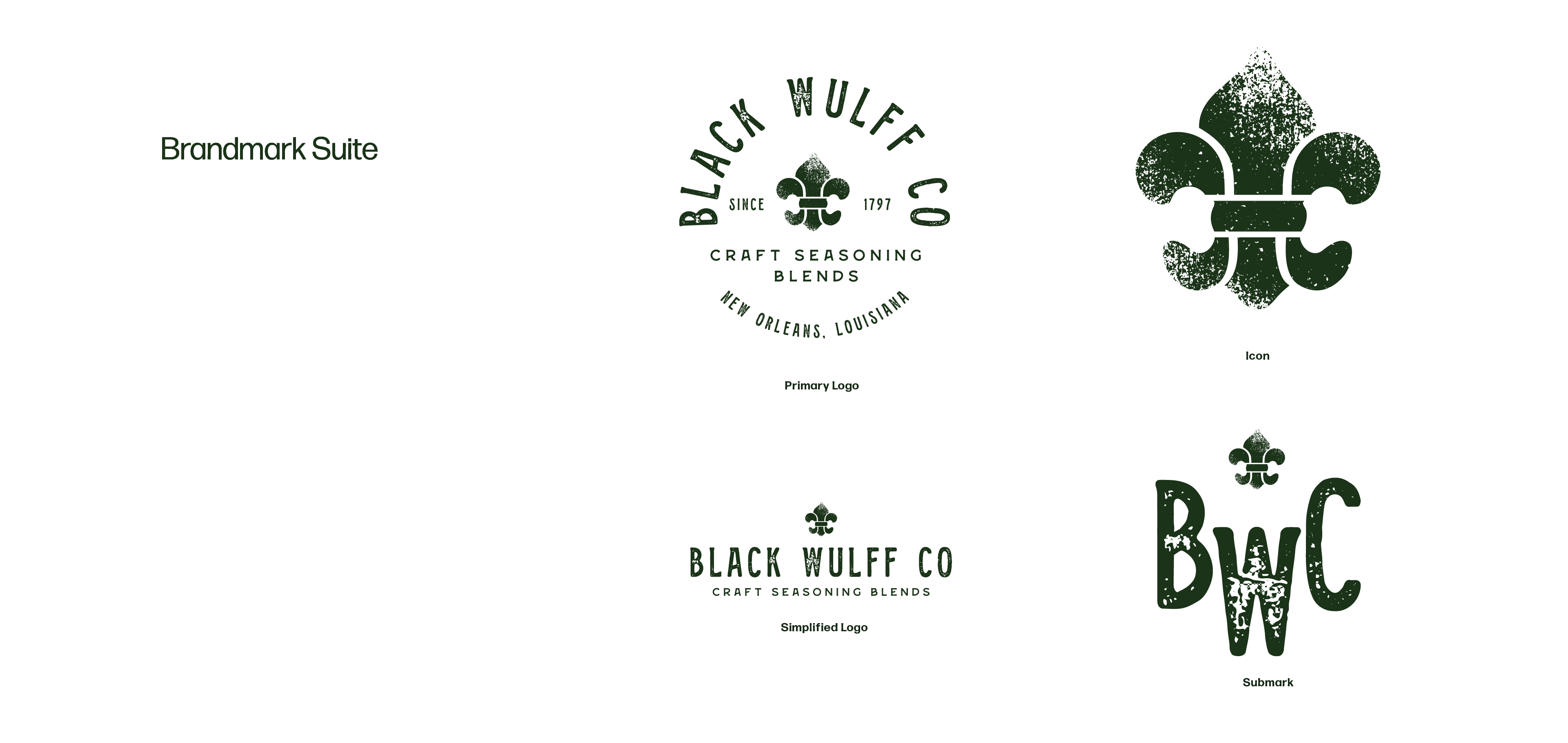
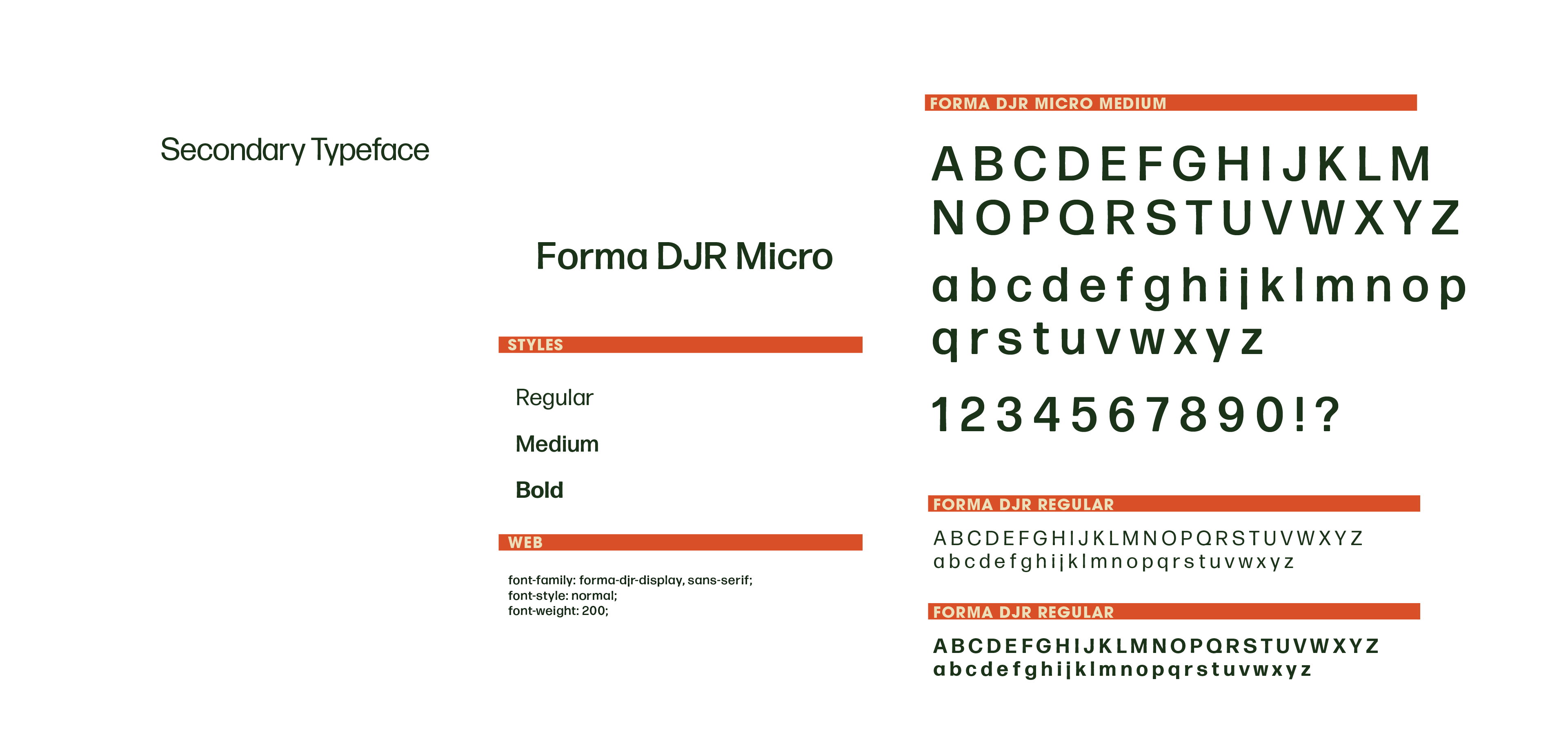
A timeless, classic vintage yet modern and simplistic feeling was the overall goal for this brand development. The brand pillars of simple, bold, uncompromising and relentless can be seen in the moodbaord above and is carried through the brand through the use and combination of vintage inspired and moderntype choices, grit through grainy textures, and the bold colors of southern creole cooking. View the full brand guidelines here︎.


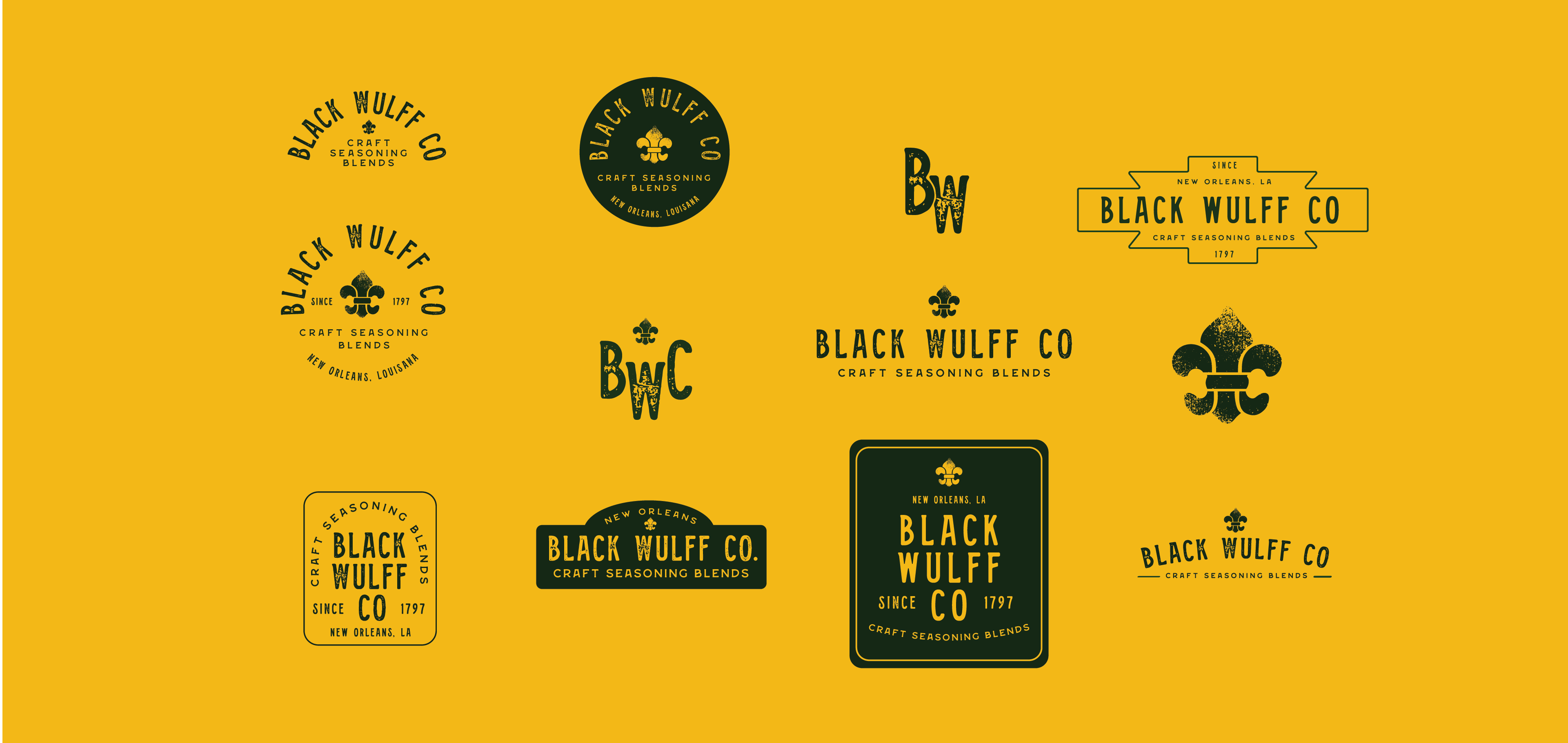
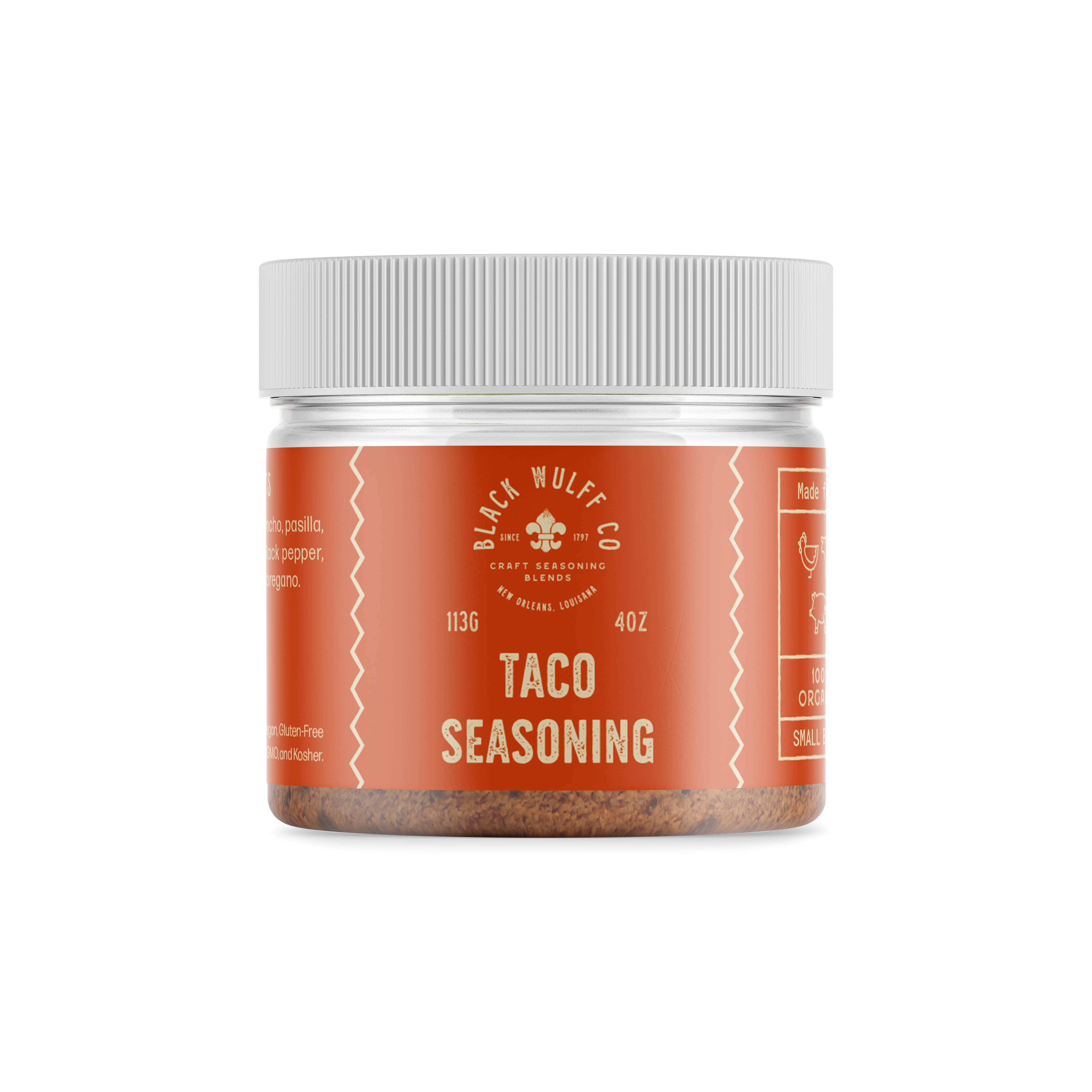
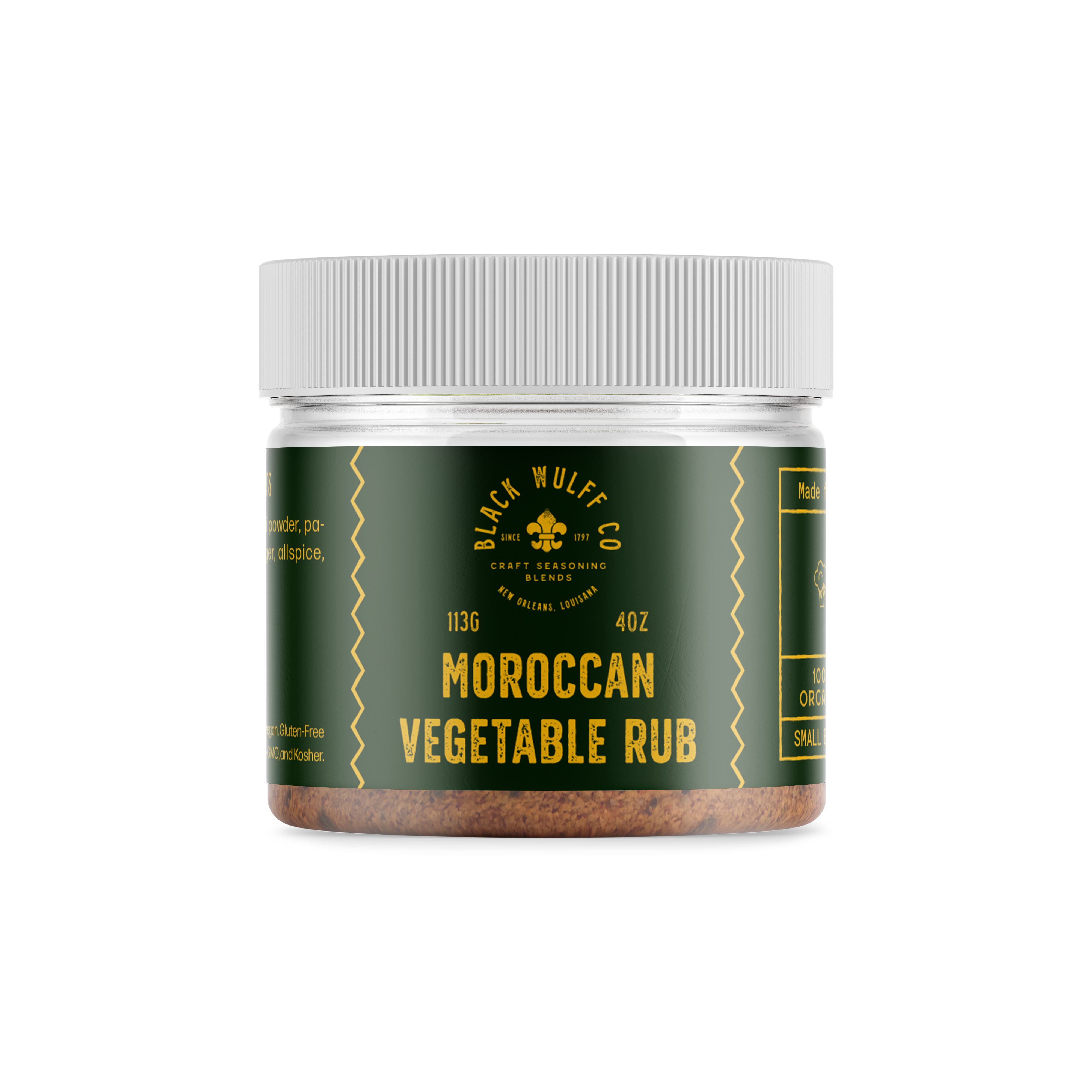
PACKAGING
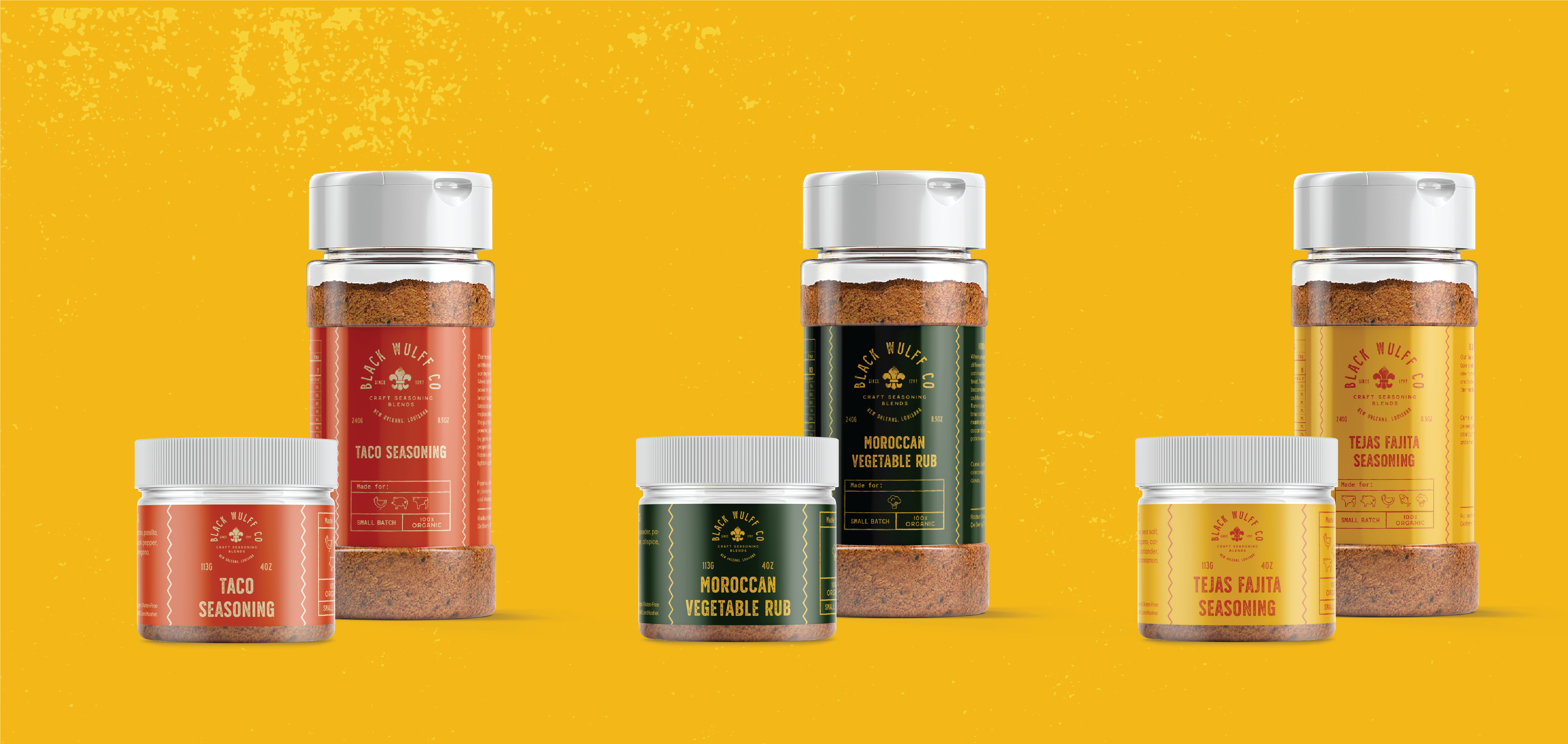
The design system refined further during the packaging development, in which my partner, Christine Chang, built out a coding system to identify specific uses for each spice. The color coding system was also signicant in identifying the usage for each spice. Labels were designed for 25 different spices in both a 4oz and 8oz size, totaling out at 50 individual label designs. Below are the three different label variations in both sizes.


READING
The Overstory
©2025 Brit Van Guilder
©2025 Brit Van Guilder